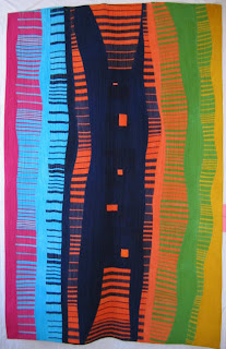
Continuing on with my review of this regional juried art quilt exhibit, I thought I'd begin with the full view of Leap of Faith by Karen Querna, detail of which I showed in the previous post. This was a huge piece, at least 5 ft in length I think. I was quite struck by it, thinking that much of its impact is due to its size. A good argument for taking our design ideas and making them big and bold. I suppose it was the abstract nature of it I liked. What IS that dark thing in the center? The more I look the more it resembles an ancient figure, an Indian shaman, a praying entity. Began to give me chills.

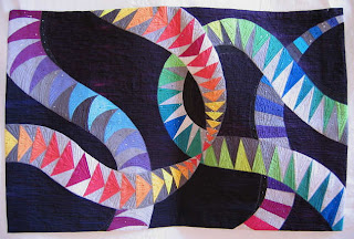
Here is the other quilt only shown in detail previously, Primordial Soup by Kay Kimball.

The detail shot here shows the alternate way she chose to quilt the goosetrack triangles. The quilting and beading added her personal signature to a design which has been thoroughly explored, most notably by Carol Bryer Fallert. See here and here. Does that mean Kay should not have tried her own version? No, of course not. However, it does point up the importance of developing one's own take and style as a developing artist. I remembered a comment from a viewer of my own Pathways, that it was nice but that she had seen similar things before. Yes, indeed, I agreed, and it was primarily an exercise to try out a technique which resulted in a very recognizable form. Again, not a bad thing, but something to be aware of as one moves to create truly individual and unique designs.

Next is Gray Area by Pam Hansen. Note the big stitch quilting in the detail shot below, as well as the couched narrow strips of fabric. It all worked very well to show the clash between the black and white sides coming together to form the "gray area."

Lynda Lynn created a great piece of flowing designs call Skin II: Permanence. To quote the artist: "This quilt explores the graphic quality of my favorite type of tattoo - tribal. The circles represent many spots on my skin." Well - I would not have guessed that tattoos were the inspiration for this one.

Note her use of sheers - it's difficult to shoot these as the solid color that they are - what looks like patterning is the way the light falls.

There were other non-traditional fabrics including decorator fabrics. The dark fabric looked to be enhanced by metallic paint.

Linda Anderson was the featured artist. I believe this next one is hers - they were not labeled, but sitting on a stage area that would indicate they were not part of the juried exhibition. She had several of these leaf-inspired works, mostly done in the colors you would expect. This one intrigued me because of her use of blue leaves.

In this closeup, you may be able to see that the leaves are individual units attached to give the look of the real thing freshly fallen to the ground.

I'll finish up my review in one more post. Hope you are enjoying these. Clicking on any picture will give you a larger view.
1 comment:
Yes I am definitely enjoying your quilt show review.
Post a Comment