Wednesday, March 26, 2014

Fabric, Ironing, Thinking

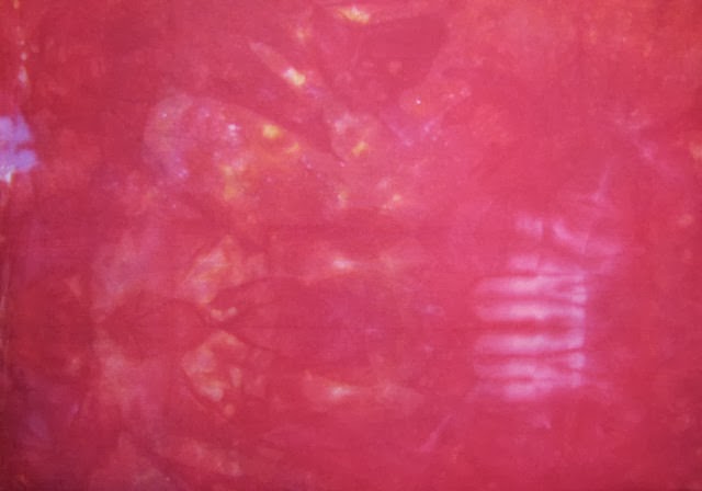
A couple of weekends ago, I was sorting through my late friend's fabric stash that I inherited, looking for just the right thing for one of the Upward Tick quilts. It's on my to do list to get all that fabric washed and filed away, so I did several loads and started the ironing last week. I honestly thought the fabric above was a batik. As I unfolded it to toss into the machine, I realized it was actually a print. It wasn't until I was ironing it that I discovered along the selvage that it is a Jeffrey Gutcheon design from his American Classic Line, which makes it much older than I thought. But as the line's name implies, this is a print that does not look dated to me, that fits in with other prints I've purchased for my more contemporary quilts. Do you remember Gutcheon?  I know I have at least one reader who does. Besides his line of fabric, he authored several books and was inducted into the Quilters Hall of Fame. Quilting wasn't his only claim to fame, though. You can read more about him here.


I know many think of ironing as drudgery, but I've always enjoyed ironing my new fabrics. Besides admiring their beauty and wondering how I will use them, I do some of my best thinking while ironing. I not only hit upon some things to try with the problematic Upward Tick with the hand-dyed cotton circles, but I also thought of a design to show off these two batiks and set of blue gradations I've had set aside for months. That's been a real problem lately, the pairing of fabrics without a clue as to what to make from them.

Wild on Birch Street - Sheila Mahanke Barnes 2005

My ruminations led me to thinking about an exercise Chris of Chris's Quilting Universe has done as part of a class (scroll to the bottom of this post) Her first idea where she rotates 4 of her sketch to create a quilt block-like design reminded me of a variation I'd wanted to try with a quilt I made back before moving out to Idaho. While pressing the individual blocks that make up the tree design, I saw the potential for an abstract quilt in a similar multiplying and rotating of those 4 units. The image of the tree as a whole would be lost, just the angled lines divided by sashing creating something interesting. I think these fabrics could pull that off quite well. I had thoughts about other designs for other fabrics too, and had the foresight to stop ironing when I did and get them down in a sketchbook.

But as enticing as these new ideas are, I need to finish up at least one of the Upward Ticks this week. My art group pretty much concurred with my thinking on them, that the one with the sheers was working best and saw the same issues with the other one as I did. I'd decided to set that one aside for now and finish up the one with the sheers. It helped to have let them sit unseen for awhile; they didn't look nearly as bad as I remembered, as is often the case. At any rate, time to take the next steps and get on with it, the first being to fuse decor bond to the back of the photo printed fabric that will make the mount for the center. Then I squared up the little quilted center, treating the edges with Fray Check. And that particular day, that was all I could face.


Today was another story - I was ready to devote the day to the studio. In retrospect, two things describe my mood: impatient and not caring. Impatient because I've been diddling over this too long and want it done so I can work on some other ideas. Not caring because I've cared too much, and I know from experience I could rearrange those circles and switch them out with other ones forever without settling on a "perfect" arrangement. Ditto regarding what techniques to use - it really doesn't matter THAT MUCH on this one. Just GO. And so I did. I'd pinned the circles so they wouldn't shift in transit to the art group meeting and they pretty much held them in place ok for the stitching. I remember well my struggles with fused sheers suddenly reading differently than those without fusible on them which is one of the reason fusing was never an option for this one. I did wonder if I'd have problems with fraying but it wasn't an issue as I zigzagged around the edges with monofilament thread.


When I attach a quilt to a mount like this, I finish the edge one of three ways: satin stitch around the outside, sew a narrow binding, or couch yarn or decorative thread along the edge. None of these were resonating with me until I remembered that a couple of my blogger friends have "bound" their quilts with sheer fabric. Here I'm considering adding a little glitz. That sheer was too much to be a circle, but it reminded me of a woman at the Mayo Clinic covered head to foot in black, not a burka, but a similar outfit. But one could not feel sorry for her as it was also decorated with a lot of gold bling, truly beautiful. I'm thinking this could be the bridge between the sheers of the center and the black metal frame I plan to put it in.

One of two versions of Upward Tick by Sheila Mahanke Barnes 2014
I cut a 3/4" strip and wrapped it around the edge, sewing it in place with more monofilament zigzagging. Then I centered it on the mount, glue basting it in place, and attached it to the mount with more zigzagging along the edge. I just ordered the frame so this final shot shows it in one thanks to the magic of Paint Shop Pro. This is one of those quilts that is a bugger to get an accurate photo of, especially since I was doing this quickly up on my design wall. The center is fairly accurate, except the red circles are reading more orange than they should. The mount is reading a bit bright; the previous picture is more accurate. In person, the two sections are working pretty well together. But regardless, it is done and I can move on.  

Sunday, March 23, 2014

Art Journaling An Hour For Whatever

This week's Positively Creative Art Journaling question was what would you do with one hour to do whatever you wanted wherever you wanted to do it? I admit I thought long and hard about this all week. Of the things that I could do in an hour, most were the sorts of things I already do or really could do if I just set the time aside. It's not like my days are so full of commitments like they were when I had a paying job and my husband and parents were alive. I can pretty much do what I want when I want, as long as I keep the bills paid,the laundry washed, the frig and pantry stocked, and the house relatively picked up and clean.

And yet, I could come up with a litany of things I'd like to do but never get around to doing. Like picking from the purse and tote patterns I've bought or pulled from magazines and making one or two. Or seeing if I can make a coiled basket from one of the two It's A Wrap books on my shelf. Why can't I set just an hour aside for either of these? Once the weather gets nice, I'll be thinking about taking hikes or spending some time at city beach just reading or sketching. But I'm guessing I'll have to fight the guilt to get me out the door.  That's when it came to me: what I'd really like to do for an hour, what would make me happy and fulfilled, would be to do any of a number of inconsequential things without feeling guilty about it.

I'm not sure this is what Dale Anne had in mind with this question. It doesn't sound very deep or profound wishing for an hour to make handbags. But it is true that I carry a lot of needless guilt around (and I thank my mother for that), spoiling what pleasure I might get out of doing something just for the fun of it. By pondering this question, thinking I had no answer for it, I did happen upon a truth. And that's what journaling of any kind is about. Or as Dale Anne says, "Art Journaling is like personal therapy!" Guess I'll have to block out an hour this coming week for some guilt-free pleasure.

As far as my spread, violet then white paint were scraped down each side with a credit card. It went better than the first time I tried that method, even though the left side came out darker than the right - more paint squeezed along the top of one page than the other? Not a lot of planning for the text which was added after gluing down images from magazines (on the right) and scanning and printing the basket images from the book (on the left). Kind of hit and miss and adding enhancements as I printed the questions and answer and then journaled in the empty spaces. Not the prettiest page but it will be a good reminder for me.

Dale Anne wrote this week how she got into journaling and how it has changed her life. It's a remarkable story and helps me understand better her reason for the way she's put together these exercises. It really is more about the journaling than about the art technique. You can read it here.

Thursday, March 20, 2014

Just For Fun!

My blogger friend Pat Denino was intrigued by a comment I left her about how I track the days by my coffee cups. Saying she'd like to see them all lined up, I decided why not? I've been collecting coffee mugs forever, each one a memory of someplace I've been (or in one case, wish I'd been). It's pretty easy to get into the habit of grabbing the same cup every morning, and once I was living alone, the mugs just weren't getting rotated. So I decided to give each its day and not deviate from that. I found it also helped me keep track of the days of the week once I didn't have a job or school helping. But I had more than 7 mugs in the cupboard - what to do? I decided Tuesday and Thursday would be days for choosing between the leftovers, keep it from being too routine. I like this system!

So let me tell you about my mugs, starting with the front row. The Fender mug is from my days opening shipments at a music store. Companies often threw in promotional items like t-shirts and mugs, and I often got first dibs. It's a nice big cup perfect for lingering on Sunday mornings. Next is my heron mug, made by a local artist. I found it the year a real heron was often hanging out where I took my walks, staring me down. I eventually took it as a sign and that he was watching over me. The mug reminds me of that year and gets my week off to a good start. The dark mug next to it has "Chicago" written in red on it. My late husband was taking lots of business trips that year, one's I couldn't go on, and he often brought me back t-shirts but sometimes nothing at all because he only saw the inside of airports and offices. I gave me a hard time about that - SURELY you could find SOMETHING...  And so on the next trip he had a connecting flight in Chicago and picked up this mug in the airport. Next is another big mug that I bought the year I spent a week in Jackson Hole, WY attending quilt workshops and sightseeing. I talked the bargain motel manager into a coffee maker for my room but we both failed to remember I'd need something to drink out of. I needed a souvenir anyway, although I was hoping to find something a bit smaller. Huge mugs were all the rage that year. Finally, that's a Starbuck's coffee cup on the end, the one with the Hopper painting. My husband had received it as a gag gift where he worked - yes, he drank a LOT of coffee. So now that he is gone, it brings me a little closer to him when I use it.

Now for those extras I choose from on Tuesday and Thursday. On either end of the back row are mugs from the Klickitat Pottery in White Salmon, WA. They take part in the local arts and crafts fair here and they always have something looking different from the rest. The darker mug between them is probably the oldest one of the bunch, bought when we lived in Spokane, WA back in the 1970's and it looks it! The light one is a souvenir from a motorcycle vacation to Canada, although it was bought before we crossed the border. We'd stopped for lunch at The Cross River Cafe in Schroeder, MN and I couldn't resist one of their mugs - my college roommate's last name was Schroeder! It traveled with us the whole way around Lake Superior, arriving home in one piece.

So there you have it, the story of my coffee mugs. And oh - it's the first day of spring. Thought I'd show you what that looked like in norther Idaho today - the view out my window this afternoon.

Tuesday, March 18, 2014

Art Journaling Where Time Stands Still


The photo leading off this recent post was a precursor to this week's Positively Creative Art Journaling exercise. Yes, I'd looked ahead, and as long as I'd returned to City Beach to photograph the ice, I took the opportunity to get a good shot of my favorite place to sit. It was the photo I would need to answer the journaling prompt of "that ONE PLACE where you want to go. That ONE PLACE where you can go sit for hours & SEE, LISTEN, BREATHE, SMELL (maybe TASTE as well) that magnificent place. That ONE PLACE where time stands still." Nothing to hide here - I've shared it multiple times, the fact that this particular spot captivated me and kept pulling me back during my reconnaissance trip to find the area I wanted to make my home. That feeling continued after I moved here and this spot continues to be my favorite place to sit. The journaling prompt fit how I feel about it so perfectly, I just copied the whole thing at the top of the page, then added more specifics on down the page - all with gel pens. I think you should be able to read them if you click on the pic for a larger view.


As for creating the spread itself, I found it quite fun. Because the spread was to be painted such that the photo would more or less blend into the page, I could get out some different colors and play around with mixing to come up with shades close to matching those in the photo which I kept close by for reference.  The photo also guided me in the placement of the bands of color.


I opted to glue the photo off center for a couple of reasons; that placement allowed a smoother blending of painted background with actual photo and played up the slight angle of the bench. It also allowed slightly better open space for the journaling.

I've seen this photo blending technique used in art quilts, where instead of using paint, fabric and/or piecing or applique is used to extend out the subject in a photo that is printed without manipulation onto fabric. I thought it was a clever use of realistic photos in quilts, just as I think this art journaling method with paint is. This spread just makes me smile, in a way transporting me to the real place where time stands still, just as it is intended to. 

Monday, March 17, 2014

Black & Tan Zentangle

Somewhere between quilting the backgrounds for Upward Tick and finishing the speaker repair, I tried another Zentangle on my official tan tiles. You may recall I had mixed feelings about how the sepia ink looked on them; thought maybe I'd like the way black ink looked better. Not really feeling it, which still puzzles me. I really thought I'd like the tan better than the white as a background for these. After doing some shading with pencil, I went back over areas with a white charcoal pencil to brighten things up and add highlights. That helped.

This particular tangle called nzeppel has been on my mind for awhile. It was a favorite back when I was working through the daily Zentangle book but I haven't used it much. I thought it might work well around a spiral. I do like the way I worked the spiral here better than on my first try. But I wish I'd gone one more round so that it was a little bigger, and more off-center, which was my intent. As for nzeppel in the background, I wish I'd made the grid for it smaller and wonkier - I just feel the proportions are a bit off and it is not as interesting as it could be. Also, as long as I am critiquing, the grid lines really shouldn't be that thick - the shapes drawn within the grid really should almost touch the grid lines except at the intersections. I may need to try this again, see if I can get it a little more to my liking.

Sunday, March 16, 2014

Back to Circles

I've been working, or trying to, on Upward Tick, really I have. Even though I have a drawing, and two backgrounds quilted, and fabric pulled, I was struggling to move to the next step. My brain was chaos about those circles I planned to add. It went back and forth about how best to approach it, then started panicking a bit about which fabrics to cut which size, and...  I do NOT work well without a plan, as some people seem to do. I felt much better once I settled on making templates from freezer paper, using my enlarged sketch as a guide and various round objects to trace around. Then, as is my way, I numbered my master and transferred the numbers onto the template. There! I could heave a sigh of relief as the chaos subsided.

But still, I could not bring myself to start cutting. Why? And why am I showing you this picture of stereo speakers disemboweled? Well, they have been part of the problem, a side project that has taken up more than a quarter of my work space for over a month. I didn't have a better place to work on them and didn't expect this diy repair of the foam surround to take so long. I'd do a little at a time, as time and health allowed, but lost my nerve when I got to the gluing part. Lot's of warnings about well-ventilated workspace and getting placement right the first time as the glue takes quite quickly. I should not have been so intimidated. The other day, I screwed up my courage, moved the speakers into the bathroom I've been using for my painting and stamping, turned on the fan and opened the glue. Huh. I could hardly smell it; that first printing ink I tried was ten times smellier. And since these are small speakers, it wasn't that big of a deal to center the foam surround properly. Within 24 hrs, the speakers were back together and hooked up, sounding like new. Now, there's a boost for my confidence!


AND I had a major portion of my workspace back. Seriously, I had backed myself into an open area pretty much the size of what you see in that first picture. Now I could spread out and work! I'm experimenting with two versions, the top one using hand dyed cottons and the bottom one using sheers. I think I'm like the sheers better, but both need more work, probably some editing. It's harder to tell about arrangement with the hand-dyed circles as I decided I'd hand applique them down, so what you see is bigger than they will be once the seam allowance is turned under. The colors are an effort to integrate the background with colors from the photo border. There's some of that going on in the sheer one too. I think it's working (better than the photo would suggest), but if not, I will have to find something else to frame them. I'm taking them to my art group tomorrow for a second opinion.

I wasn't thinking about it when I devoted the better part of yesterday and some of today to this, but Saturday was National Quilting Day. I may not have revved up my machine, but I did have a lot of fun with fabric. How did you celebrate the day? 

Friday, March 14, 2014

March on the Lake

Considering that a few weeks ago we got 9 inches of snow, our current warm-up to 50 degrees is quite the contrast. After a weekend of rain rain and more rain, two days of this warmer weather coupled with SUN! sent me off to City Beach for my walk. This is my favorite place to sit, the impact that the view has on me lost in the photo. Can't really explain why this particular view feels so special, but it has healing powers for me. I often come here if I am troubled, sad, or in need of working something out. It's also a great place to just be when there's not a thing wrong, and when things are in fact great for a special reason. However, with the breeze off the icy lake, it's still a bit too chilly for me to want to sit and linger.


I wasn't the only one enjoying the park, of course. There were the usual hunters with their metal detectors taking advantage of the low level of the water, people walking with dogs (which raises the question, "What part of 'NO DOGS IN PARK' don't you understand?"), parents with young kids, and people like me just out to enjoy the sun and the view. Frankly, I did not expect to find ice along the shoreline and no one was concerned about "No LIfeguard On Duty". I've seen people wading in the water when the rest of us were still bundled up but not this day.


People had been playing with rocks along the beach. Soon these will be underwater.


Actually, I'd not taken my camera the first day, thinking there'd be nothing to shoot. Luckily, the good weather continued the next so I could get these shots. But even in 24 hours, the ice had started to recede, or maybe the water level rise. I didn't remember this stack of rocks being in the water like this.


But this is the real reason I came back with my camera. This is on the north side of a jetty. I was fascinated by the patterns created, I'm assuming by the wind and the gentle movement of the open water. Maybe by the thawing and refreezing as well.


Looking the other direction out into the lake. Lovely curving scalloping line. Not sure how well you can see it (click on pic for a larger version) but the lake had three distinct bands of color, ending in the dark blue on the opposite shore.


The edge of the ice was a bit broken but hanging together as the water rocked it up and down. 


The next section was quite smooth ice, but with some longer cracks. And finally near the shore, the rounded undulating forms.


They've been replacing the wooden benches with these metal ones, which I noted had some great design motifs and beautiful lines. In fact, I couldn't help but think, now there's a classy elegant bench! I bet if it could talk, it would be with a French accent. "Oh, mon ami, come seet wiz me..."  Oh, did I just butcher that terribly??? 

Monday, March 10, 2014

Time to Over-dye

I've had Ann Johnston's fabric dyeing book, Color by Accident, for years. Even though I'd been dyeing for a few years, part of that time as a business, I was still curious about how others went about it, always wondering if there was a better way. I had quite a bit of dye concentrate left over from my snow dyeing experiment and had been thinking about how to use it up before it lost its oomph out in my cold cold garage. I pulled several other books on dyeing as well, but settled on Ann's because my concentrate was mixed pretty much per her instructions and her method includes applying the dye before adding soda ash. The way I've always done it is by adding dye concentrate to the soda ash solution, then quickly adding fabric. I'd seen side by side examples of both methods and there definitely was a difference. Ann's method looked simple enough, plus it is the one used by one of the members of my art group. I decided to use it to experiment with over-dyeing these two half-yards from my dye session last August. I'd been unhappy with the uneveness of the dye saturation, so they were prefect candidates.


The set-up is simple enough: wet your fabric in a little water and then arrange it in the bottom of a bin or other container. I just "scrumbled" each piece in its own bin plus added a third half-yard of white fabric to a jar to act as my control factor. Next pour the dye concentrate which has been slightly diluted over your fabric. I had golden yellow and basic red which I squirted over the fabric in pretty much equal amounts. I combined what was left in a single bottle and poured it over the fabric in the jar.  You can press on the fabric as much as you want to help distribute the dye or just leave it alone. I really wanted to leave it alone, but was worried about air pockets and the like so tried to hit a happy medium between nothing and too much. Really wanted to see a variety of colors in the end.

After the fabric has soaked in the dye for about 15 minutes (note I bought a new timer just for this!) it's time to add the soda ash. This is extremely low water immersion dyeing and I admit to being skeptical about the half cup of soda ash solution being enough (my freezer bag method require 2 cups per bag). I'd brought my liquids in from the garage the day before to get them up to room temperature, but as I mentioned before, I barely keep my house at that minimum temp so also invested in a thermometer to check my water temps. I warmed the solution in the microwave a bit before pouring it over the fabric. Again, I felt  compelled to press down on the fabric to make sure the soda ash got distributed, even though I really wanted to leave it all alone. That's it - now the fabric sits for 1 to 4 hours before processing. I waited the full 4 hours.


I have to say I'm really happy with the results! The one on the left started out blue and had the most variation in colors and the one on the right started out lavender, bits of which showed through here and there. So much interesting texture going on, showing through from the first dyeing.


I didn't have a sense that I was doing more manipulating of the lavender piece but it came out the most solid. I believe I pretty much covered it with the golden yellow before adding the basic red.


The over-dyed blue is by far the most interesting of the two. Seen as a whole it is not a particularly pretty sight, but it has some great areas and so much underlying texture.


I was counting on the golden yellow turning some of the blue to green, and you can see that happened in a few places. I sometimes say I can't bear to cut into some of the specialty hand-dyes, but I will have no trouble cutting into these.


As for my control piece, the one that was to show me what the dyes would look like without the modifying of the underlying color? Well, I wasn't sure where that piece of fabric came from, either inherited from my friend's or from my mother-in-law's stash, but I was certain it was cotton. Apparently it is a cotton blend as it came out a lovely sherbert chambray. I burned a few threads to confirm and yes, part burned to ash while the rest clumped into a hard ball. You can pick out the threads in the weave that picked up more dye than the rest in the closeup above. I really quite like it.


I had loosely pleated it, then twisted and coiled it before stuffing it into the jar, but there was practically no resist pattern as a result. This was about the only spot that showed any texture. I'm not sure why that was.

You may note that this method does not call for salt, something I have always used. When I was doing my snow-dyeing research, I noticed on the Pro Chem site mention of the fact that salt was not necessary. That reminded me of an internet friend who had run an experiment to see if there was any difference between using salt and not using salt, and she could not see any. Now here was Ann not only omitting salt but explaining that it can actually keep dye from getting into the fibers when using so little water to dye. Apparently the use of salt IS necessary if you are using the old methods requiring lots of water, lots of dye and lots of stirring, the salt helping to pull the dye in. But remove all that water and the chemistry changes. I can't say I'm sorry to no longer have to add salt to my dye bath. 

Sunday, March 09, 2014

Art Journaling What You Want

This week's art journaling exercise uses something I've tried before - drawing wavy lines in which to write your text - see this post. The spread is simply painted, the lines and text applied with the blue pen from my new gel pen set. It was suggested to practice on a piece of scrap paper to get the spacing down right, and I was glad that I did.


So the journaling prompt was to think about something that you really want and why you want it. I really want to visit New Zealand someday - it's been on my list for years. I've blurred my reason - you don't mind that I keep it private, do you? On the opposite side of the spread we were to add a picture or collage a group of pictures cut from magazines or even use a personal photograph on hand. Would you believe I could not find a single image of New Zealand in my stack of magazines, not even in New Zealand Quilter? I guess the dream is all in my head at this point. So I searched the internet for images to download. What a beautiful country! I printed them from Corel Paint Shop Pro where I sized and collaged them on the print layout screen. After pasting the cutout onto the page, there were some blank spots which I decided to fill with spirals reminiscent of some Maori designs. I went over the letters a second time to darken them, and because of that lime green in the map and the lime green in my pen set, I went over the lines, around the pictures and filled in the spirals with green. And now we have told the universe what we want so we can let it go and let the universe bring it to us. Do you believe in that?

I also did some dyeing today - it's in the wash right now, so pictures soon.

Thursday, March 06, 2014

Pairings

When there's been a lapse of creativity in the studio, regardless of the reason, sometimes you just need to get in there and do something...anything...and you can get going again. I'm ready to move on my next art quilt, already in progress, but it's a bit of a mess in there. As I looked around the room, I could see a little straightening up was in order, to free up the work table, design wall, even the ironing board. Time to take down the dyeing results from August and clear the table of the the snow dyeing of last week. But look what happened instead. The design wall is now totally covered with new pairings, new ideas.


I hate it when this happens! I'm trying to stay focused on a couple of specific design ideas, but my brain won't stop seeing new possibilities. When I first put these purple beauties up, wondering what I would do with them, I remembered an African batik that might work with them. There was a collection of them that I'd wrapped around one of those cardboard things that fabric comes on - if you catch a fabric store on a good day, they often have some ready for the garbage and they are more than willing to let you take them off their hands. They are great for longer lengths of fabric or anything you'd like to store without creasing. After washing and ironing these fat quarters, I didn't want to fold them up, so stacked and wrapped them onto the cardboard holder. (What are they called????) When I pulled them out to see if the purple really did work with my new fabric, I just leaned it against the wall, didn't actually peel the fabric off and put it up. Now I know I'm not going to do anything with this for awhile, so I was going to put it back in the closet. Well, maybe I shouldn't put it out of mind like that, so I unwrapped the neat little package with the intention of leaving that top batik and the purple fabric on the design wall for now. It was like opening Pandora's box.


I definitely have so much wonderful fabric collected over the years, and often I've forgotten some of them. I'd definitely forgotten the majority of these. Why were they suddenly the possible answer to what to do with these newly created hand dyes of mine? Remember the stitched shibori overdye experiment that disappointed, so little of the original green showing and now reading a different color? Hard to see in this photo, but now that bit of green showing through is the same as what I'm seeing in the batiks.


And then there was the pole wrapped overdyed shibori from the follow-up dye session that came out so well, a part of one of them peaking out on the right in the picture above. It looks like golden water to me and I intend to quilt it that way. I suppose that might be enough but I've been hoping to come up with something to make it more interesting or help finish it off. Another set of these African batiks have all the right colors and differing values, offering glimpses of a more exciting piece if I can figure out how to incorporate one or more of them.


The other pole wrapped piece was oriented the other way and it too will be quilted along the shibori lines as if they were ripples in a lake. Again, I've been thinking it would need more, and had run across some sheer willow leaves I'd made and had not yet found a home for. I think they'd be perfect scatter across this piece, but again, I felt just a knife-edge finish and nothing more might be a cop out, that I could find a way to add to its basic beauty. This African batik has just a bit of the golden yellow along one edge and then gradates a beautiful deep blue/purple. As I was holding up that yellow edge to my shibori piece, the light reflected off the surface revealing these leaves. All these batiks have been done over jacquards of various patterns, some more obvious than others. This one would echo my idea of adding the three-dimensional leaves.


Also a puzzle what to do with is this piece from the same dye session, created in a tall narrow jar. I often can't bear the thought of cutting these specialty pieces up. I've auditioned different things against it, tried to think of something interesting to applique on it, have come up empty. I never would have thought to try something so dull next to it, but I think this may be what will make an interesting combination. Exactly how I don't know, but I like the possibility. It glows anyway, but something about that dull dark orange and red batik sets it off even more.


Finally, here is one of the snow dyed pieces I was lukewarm about, partly because I was expecting something else and partly because I thought it was too much like ones I already had. I guess I'm tiring of the ubiquitous fuchsia/blue combination. What a surprise to find this batik in the group, so very different from the others, and my snow-dye a perfect complement. What I would make from these two fat quarters, I have no idea, but I love that they want to do a dance together.


Well, that was an interesting and fun exercise, although having nothing to do with March's line-up. I'm sure it did me more good, though, than had I dived right into what I was trying to clear space to work on. And although the design wall remained totally covered in non-related ideas, I did spend a little time with my next project, Upward Tick. I'm going to work on two versions simultaneously as I can't decide between two different border mounts (photos printed on fabric), and whether to use regular cotton or sheers for the circles I'll be adding. The background fabric had already been cut, has been waiting for me to cut the thin black line and fuse it on. One piece got a blue/black batik line which looked much harsher than anticipated. So the second got a dark grey one. Next comes quilting, at least on one of them, before any circles are added. But I couldn't help pulling some sheers and playing with some fabric scraps to get my mind moving.

Wednesday, March 05, 2014

Some Thoughts and Favorite Artists

Bluebird Sketchbook Page by Mattias Adolfsson - Mattias Inks
I follow some artists who are not art quilters, always with an eye to what I can learn from them that would be useful in my own endeavors, and also just because I love what they are doing. With my own activities at a low ebb, this seems a good time to share some recent work that caught my eye. Above is a sketchbook page by Mattias Adolfsson of Mattias Inks, a freelance illustrator living in Sweden. He has a quirky sense of humor that I find appealing, populating his worlds with the most amazing creatures in such incredible detail. But I share "Bluebird" with you because when it popped up on the screen, my first thought was to wonder what he was doing showing us a quilt. Ah, no. It's one of his illustrations, finely wrought with stitch-like detail. Yes, it gives me ideas.

Richard Saja collaboration with Mother of Pearl

Richard Saja detail
Richard Saja of the blog Historically Inaccurate, is a textile artist I've shared before (see this post). He works mainly with toiles that he meticulously adds hand-embroidery to. He too has a bit of a quirky sense to his interpretations. He recently collaborated with the British fashion house Mother of Pearl, and you must see the results here. What caught my eye with this group is how effective adding color to just a portion of the textile can be, as in the example above. I guess I think all or nothing, but here, the unembroidered portions act as a frame to showcase his work as well as flatter the wearer.

Medallion I by Daniel Sroka

I have also been drawn in by the work of photographer Daniel Sroka, whose only quirk is that he produces extreme close-ups. He works with dried leaves or twigs or other things he picks up on his walks, studying them to reveal each's unique personality, a tiny bit caught in focus while the rest stays a blurred backdrop. Like me, he often sees images in ordinary objects: a seashell that suddenly looks like a slipper, a curled leaf becoming a chalice. Like other parts of the country, we got quite a bit of snow yesterday, which I only shoveled, not photographed. But Daniel was out on his deck capturing the most beautiful images of the snow and ice as they melted and sharing them here at Daniel Sroka Open Studio. See the entire set here. 

Are you inspired yet?

Finally, I want to share with you a quotation I ran across a few days ago. There's so much discussion about what is art and what is an artist and what should or shouldn't an artist be doing with his/her work. I liked what Dr. Daniel Siedell of King's College had to say in "5 Things Art Is Not", especially this:

"An artist does not paint a picture to express what she already knows or believes. She paints to learn something about herself and the world—something she doesn’t already know. Oscar Wilde wrote that the work of art "has an independent life of its own, and may deliver a message far other than what which was put into its lips to say." A work of art does not point back to its maker, but looks out to you the viewer. It’s not concerned with beliefs or thoughts of its maker. It’s addressing you and your heart." 

Tuesday, March 04, 2014

February Wrap

This won't take long. February is a short month to begin with, but my quilting really took it on the nose since so much of the month was devoted to all things sinus related. When I made out my list of things I might work on, I transferred the few things I didn't get to from the January list and added quite a bit more - very optimist. As I look at the list now, I see I only managed to cross off one thing, finishing the quilting and binding on the half-square triangle quilt. All else remained thoughts and dreams in my head - not totally bad. The art journaling is not part of the list since it is a weekly routine, & I did managed to stay faithful to it. I also don't note sketching activities like the Zentangles, although maybe I should. They were a good substitute in those weeks after the surgery when working in the studio simply was not an option. The snow-dyeing was an impulsive spur of the moment thing - I allow for that, and I must say it felt very good to be doing something - anything - with fabric again.

I want March to be different, of course. I'm planning on applying for ArtWalk again, so need to finish a piece or two for the application form due mid-April. Those pieces were on February's list, so they will top March's list. I have the makings of another padfolio ready to go (and a taker for it), so it too is on the list. In fact, I can pretty much scratch out "February" and write in "March" and be ready to go. Now, if the body will just match the willingness of the spirit!

Sunday, March 02, 2014

Art Journaling with Bubble Wrap

It's Sunday already and time for another spread in the Positively Creative Art Journal. I'm guessing there's hardly a reader of my blog that hasn't heard about stamping with bubble wrap, and probably many of you have actually tried it. It's been on my radar for years, and yes indeed, when I rummaged through my stamping/painting supplies, I found some small pieces of bubble wrapped tucked away. These are very small bubbles, and probably because of their age, a bit deflated. Still, they worked just fine. First step, stamp a few times across the unpainted page with one of the colors.


Second step, paint over the page with another color. Remember the nice swirls I said I got on a previous page but lost because I added more paint to more thoroughly block out the text on the paper? I used that same brush and color of paint here, and since the bubbles were not to be totally obliterated, I didn't have to worry about full coverage. The directions did say to wipe some of the paint off, but that wasn't necessary. The yellow did knock back the green a bit more than this picture would lead you to believe.


Third step, stamp with the bubble wrap again with a third color. I'd rinsed the first color out of the foam brush and thought I'd squeezed all the water out, but there was enough in there to leave the violet paint a little thin. A different effect that I did not dislike.

While the page dried, I reviewed the journaling prompt. I'd read through the lesson after finishing up last week's spread and had been thinking about Dale Ann's challenge to avoid using "don't", "no" and "not". Catch yourself phrasing something in the negative using one of those words, try rephrasing it in the positive. I know what she's getting at here, but I truly found it difficult to catch myself saying or thinking things that needed to be rephrased. Instead, I started thinking about how it feels when someone says, "Don't" or "No", and what might be a good response. I think that thought comes from my iRest Yoga Nidra practice of the last few months as well as my resolution word focus of "explore". How can you explore if you put up barriers of don't do that and this is not working? I roughed out a possible design so I wouldn't forget. 


As I prepared to add text to the page, I was happy that cut and paste was optional - not really in the mood to page through magazines for letters and words today. But I haven't been terribly happy with my printing on previous spreads. Wait! I have an alphabet stamp set! Time to get it out and use it.


I've really liked using the Gelly Roll pen but I only have it in white. My other pens have not always worked well on the acrylic paint and I've been frustrated by the limited number of colors on hand. So when I went to Staples to take advantage of their 20% off everything in your bag sale, I was hoping that they would have some gel pens in stock. I took a chance on this set by Sarasa, partly because of price and partly because of the variety of colors. They flow quite nicely and the retractable feature is quite convenient. The .07 point gives a thinner line than I'd hoped but so far that is the only drawback. According to the label, they are archival and acid-free, and I found they flowed across the painted surface without a glitch.


So I used a couple of different colors to help isolate the negative stamped words from the challenge response to them, and added some additional text borne of my yoga studies. The wavy lines filled in with cross-hatching didn't work quite as well as I thought they would, but I'm reminding myself that this is part of why I'm doing these exercises - to try things and see what works and what doesn't. Why not?!?


Oh, and one last thing. I decided to use a babywipe to clean off my stamps, and it was quite messy. Oh, let's stamp the excess ink off first onto this scrap piece of paper that has been saved to use in a future lesson. Ooh, I like that! And then I stamped on the babywipe and saw a good image come off. I swore I would not save these babywipes to incorporate into my art as some do, but here I am, my waste-not-want-not mantra leading me astray...