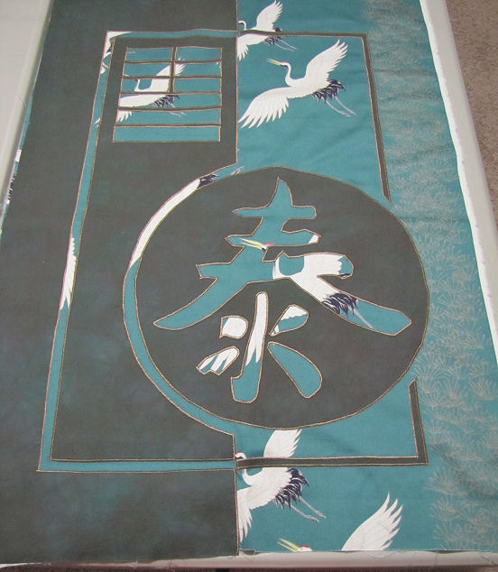
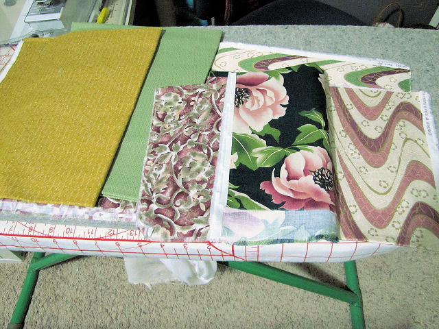
Let's get to the quilting first. I'm slowly making my way around the satin stitched applique edges. Not much to see, it's a lot like stitching in the ditch. Holding the layers in place and starting to add some dimension.

And this is one of many reasons I dislike working with Misty Fuse. I don't care what they say about "fusing" it down, that if it loosens just iron it again, longer and maybe with more heat. I've had this "bubbling" happen to me on more than one project and it doesn't seem to matter how many times I hit this section with an iron, the Misty Fuse underneath still refuses to melt the two layers together. Am hoping the quilting will make this "disappear".

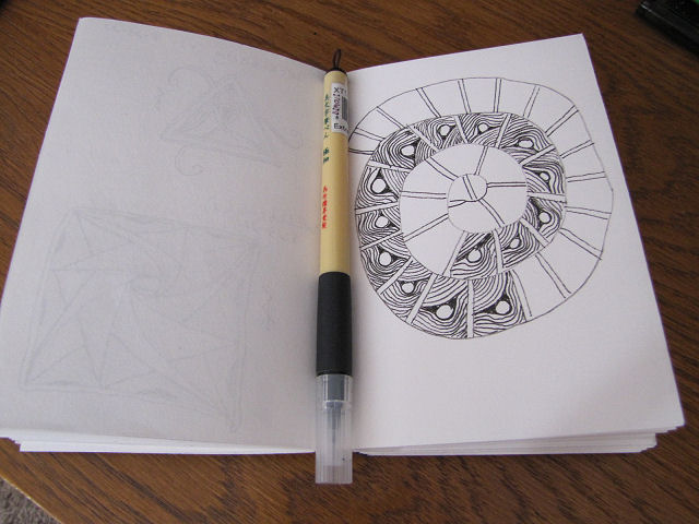
On to happier things. I can't express just how much I have enjoyed the steady drawing I've been doing. The Zentangles are meditative and relaxing, the daily #Inktober prompts quick and just the right amount of challenge to keep it interesting but not overwhelming. The Zentangle above starts with the star shape and then the Zentangle people flip their translucent tile and start working from the back. That I cannot do so where they were filling in dots with white gel pen all over the star, I simply drew small circles in a pattern pleasing to me. I enjoyed the addition of the "pods" around the outside of the star (pod is not the tangle's name but that's what the demonstrator kept calling it) but I skipped their final step of blacking out the rest of the space beyond those shapes.
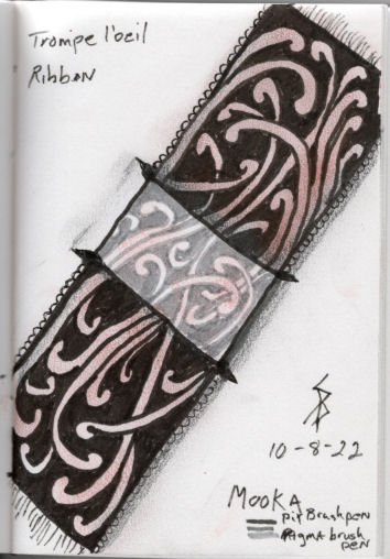
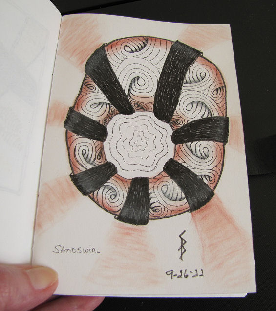
I have to admit I found this next one way too fun. It turns out that the idea to start using the translucent tiles came from an old illustrated book that the Zentangle people own. In one part the illustration is done on parchment paper which is translucent, with part done on the flip side so that the thing being illustrated looks like it threads through a slit in the paper. Thus the idea for drawing Mooka tangles on a strip that would look like a ribbon threaded through the tile. Well, again, I'm working on regular paper but it occurred to me that I had some grey brush pens I could use to get the same effect they were getting by drawing on the flip side of the translucent tile. Because of all the background to be filled in with black, I switched to a Pitt brush pen which handled much better than the last time I tried it. They added just a hint of color with the pastel chalk pencil so I tried applying a little Art Graf with my finger and it worked fine.
And now a week's worth of #INKtober2022 drawings - enjoy!