Monday, May 14, 2007

Goals for the Week of May 14

I found myself writing at the top of my weekly goals list, "GET ORGANIZED," and so that is what I did today. After a busy weekend, I felt particularly unfocused this morning, and the state of my studio coupled with a feeling of chagrin as I saw what didn't get done last week inspired me to go beyond my usual 15 minutes of ritual preparation.

First I decided it was time to clear the work table of fabrics I definitely will NOT be using in the angel quilt. I've gotten so many wonderful responses to my request for opinions regarding background fabrics, and also some thoughts on bordering strategies (see this post). Besides polling my blog readers, I also asked, via e-mail, 6 of my Wisconsin quilt friends )who used to be close enough to come right over to give me advice), and, of course, members of my church during coffee hour. This last group's reactions were particularly interesting since none of them are quilters or even artists. But as I've noted before, they are certainly art savvy. The women seemed more drawn to color & mood than the men. It was highly amusing to watch husbands correcting wives' choices by pointing out lack of contrast between the angel's gown and some of the backgrounds. I'd say overall, the first two backgrounds got about equal number of votes, with a handful going to number 4, that lovely mosaic which in fact was my secret favorite. Number 3 was a clear loser. (But it might make a nice backing...)

Of course, all of this discussion also brought up additional possibilities, so while I put fabric away, I also pulled out a few additional ones. I'll write more about this in a separate post. For now, suffice it to say that auditioning has moved from the table to the design wall, and I spent some time staring, considering and pondering. I haven't finalized a thing, but I'm less confused than I was and excited by some new options.

Next I completed the documentation files for the last two quilts I completed. I'd printed off pictures, so those were attached to my form, along with swatches of fabric and stitching samples. The little bits of information filled the appropriate blanks and I could at last file these forms in their notebook. A goodly portion of my table top was now visible for the first time in weeks. Unneeded scraps found the wastebasket, rulers made their way to their holder and scissors, rotary cutter, pens and pencils slipped into their basket. Ahhhh....semi-order at last!

I was about to take a break, but I was feeling too energized not to do one more thing. I'm hoping to find time this week to make a small bag from a pattern I recently purchased. It requires fusing the outer fabric and lining together before any sewing proceeds. I'd left the Wonder Under from the angel out so I could do this, and this was my first chance. I fused the pocket piece which is using one of my leaf print trials - see picture below. It felt like a good start to insure that I follow through on making it before the end of the week.

There are small scraps of Wonder Under in a pile on the table, also left over from working on the angel. I saved them with the idea I could put some paint on them and use them in my next journal quilt. I think that will get done this week too.

I've probably put too much on my list, but I was feeling ambitious today, or at least tired of not getting more done. Here's the complete list - wish me luck:
  1. GET ORGANIZED! (Working on it...)
  2. Catch up documentation files. (Done!)
  3. Rough out border design for Angel quilt and finalize fabric choices. (Made a few sketches today and getting closer on the fabrics.)
  4. Paint interfacing for journal quilt.
  5. Sew organizer bag using leaf print.

Thursday, May 10, 2007

Block Contest

The responses I'm getting to my opinion poll (which background fabric best shows off the angel - see this post) are quite interesting. If you haven't voted yet, there's still time to weigh in because I've been slightly diverted from that project this week. A look at the calendar reminded me it was time to work on blocks for the Peggy Beals Quilt Block Contest, something I do each year. Learn more about this contest here and see last year's blocks here, here, and here (this one made it into the raffle quilt).

This year's theme is "Scrap quilt" and the winning blocks will be sashed in buttercup yellow. I always try to use my stash of precut squares if possible, so the first block I tried was this Trip Around the World on point. I can always use practice working with color and value, not to mention loosening up a bit by adding an oddball fabric to a round. Some of the fabric in it is quite old, dating back to the early 1990's, and some of it isn't even mine, but castoffs from various guild projects or friends' throwaways. I gained quite a reputation for what I was pulling out of the trash. I always feel vindicated when I actually use these rescued scraps, and I quite like the way this block turned out.

I also always check my Electric Quilt BlockBase program to search for blocks with the theme in their names. I didn't think I'd find any with "Scrap" or "Scrap Quilt" but I was wrong. This one is called Scrap Zigzag, and was quick to make. However, when it was all together, I had a "what was I thinking?" moment. I guess I was thinking that the yellow was light enough to still show ok with the buttercup yellow sashing, but for some reason, I didn't think so much of the yellow would be right on the outside. I really think this is quite ugly, but I'm sending it anyway because all blocks go into quilts given to charity. They will find a home for my ugly duckling.

Next I defaulted to one of my favorite blocks for using up scraps - a string block. I've used this to make quite a few quilt, including one totally from hand-dyed fabric. The beauty of this block is the use of the same fabric through the diagonal of all blocks. In this case, I made four 6" blocks with the purple running through the diagonal, then randomly chose strips from my scrap strip drawer (less than 1-1/2" wide but no less than 1" wide and many angled). The four are then joined to make a 12" block with an "x" through it. In a full size quilt, these diagonal strips magically become sashing and help calm the otherwise chaotic block. I always sew these on some kind of foundation. This one was done over packing paper (which is essentially newsprint and something I have a ton of) which has to be removed, but I've also done them on muslin foundations. Not only is there nothing to remove afterward, they sometimes don't even need a batting because of the extra layer of fabric. To be honest, this block disappointed me a bit too. As a single block in a sampler quilt, it just isn't as dynamic as I wanted it to be.

This meant I really needed to try one more block. I decided to play with my 2-1/2" squares, alternating them with 4-patches made with 1-1/2" squares. I had the white/green half-square triangles in with the squares, leftovers from another project, so I laid them out first. A quick perusal of my 1-1/2" squares led me to believe I'd only be frustrating myself if I tried to find pairs to sew into 4-patches that would go with these so I sorted through my 2-1/2" squares instead. And I very much like the result. This looks like a true scrap quilt block to me.

Saturday, May 05, 2007

Soliciting Opinions

Last week was a bit weird. My mother used to say: "The hurrier I go, the behinder I get." That's how I felt most of the week. I never got around to posting goals for the week, but that doesn't mean I didn't have any. In spite of it all, I did get most of the things on my list done.

Which brings me to my need for an opinion or two. I've started work on the quilt I plan to donate to my church. My original design is based on this angel from the chapel at Christ Church Cathedral in Eau Claire, WI.

Here is a very poor picture (pre-digital camera) of the quilt I made for the Cathedral's fundraiser about 5 years ago. The winner of the auction donated it back to the church to be hung there for all to enjoy. The sanctuary where it is displayed is a bit Gothic in nature and the angel rather glows in this dark space, much to my delight. Go here to read more about the history of the church. Scroll to the bottom of the page for specific information on the chapel and the angels.

So it seemed a simple thing, since I still had my patterns and most of the material on hand, to recreate this quilt with modifications for my new church, St. Agnes Episcopal Church. We are moving into a former Jehovah's Witnesses Kingdom Hall, more meeting hall than traditional church, and as we remodel and redecorate for our own use, some mention has been made of playing on the nature theme - trees and lakes and rivers being all around us. This angel on a black background just won't do, even if I was compelled to make a duplicate.

I'm hoping to have this done by June first, so I wanted to get the angel together and audition backgrounds by week's end, which I did. I'm fusing the applique, using Wonder Under. On the larger pieces, I trimmed away most of the fusible to avoid a totally stiff center. I learned about this the hard way. These fused areas do not draw up when quilted, so if the majority of the completed top is not fused, everything but the fused areas will draw up nicely with wonderful texture. The fused part just sits there flat, or worse, bulging.

The neat thing about fused applique is that you can construct it totally off the background if you use a Teflon applique sheet. Here you can see how I've placed the translucent sheet over my master pattern. Then I just positioned the pattern pieces on it, guided by the pattern showing through underneath, and lightly tack them together with a hot iron where they overlap. Now I can gently peel the applique off the Teflon sheet and place it on each background I wish to audition. I've turned back part of the angel so you can see the narrow bit of fusible on the larger pieces.

I had two fabrics I thought would work well as backgrounds, but in the meantime, I stumbled upon two more options. And thus the dilemma began. I can't tell what's swaying my opinion as I consider the merits of each. My "gut" feeling has led me astray before, as has thinking too hard about who will receive it or where it will be hanging. I need a second, or third or fourth opinion here. Please "vote" for the one you think most effective, and feel free to add why you think your choice is the one. Also feel free to suggest something different. I'm totally open at this point. Oh, and the strips of fabric along the sides of some of the pictures are ones I'm considering for the border.

Background 1:

Background 2:

Background 3:

Background 4:

All pictures appear to have their links intact, so you should be able to click on any of them for a larger view.

Friday, May 04, 2007

Let Your Music Out

"Most of us go to our grave with our music still inside of us."
author unknown

Thursday, May 03, 2007

And now the OTHER April Journal Quilt

My journal quilt partner, Judi, has done another wonderful interpretation in fabric of a photograph. This time, she started with a photo taken by Jana Murphy, who is the Environmental and Reclamation Manager for Flambeau Mining Co. in Ladysmith WI. Jana has graciously consented to allow her photo to be posted here. The photo was taken during a prescribed burn on the reclaimed prairie being done by Applied Ecological Services where Judi is employed. The crew member in the picture is Chuck Campbell.

Here, in Judi's own words, is how she did it:

"Went into Photoshop and pulled Chuck out of the picture, then reversed him. Just had the picture up on my computer to look at while working on the quilt. I made a sandwich of white top with line drawing of design, batting and backing. Stitched around sandwich at 8.5 x 11 but the sandwich was bigger to allow for shrinkage. Stitching around the edge kept the 3 layers together as I worked and also let me know about where my area was."

"Put on the sky and tree background and quilted in the tree designs. Next added the grass fabric and quilted this heavily except where the fire and Chuck would be. Added the smoke and quilted it."


"Printed a picture of the flames at the correct size and used as a template to copy on freezer paper, then transfer on fabric. Quilted the flames."

"Added Chuck out of Ultra suede with the details of the equipment that they use in color. Quilted in details. Stitched around trimmed edge with a small zig zag to finish edge....didn't want to bind because it would have cut off some of the flames. Also was running out of time and in major pain by the end of 11 hours of sewing."

I cropped the photo she sent of the finished quilt so that edging detail doesn't really show. We don't consult or share in advance on these quilts so we are always amused to discover those times when we try the same thing or have the same issues. This time it was the edge finish - we both opted for the zig zag finish for the same reasons. We also seem to be trying methods to reduce construction time. Her method of attaching the applique as part of the quilting process is not unlike what I've been doing on some of my pieces. Great minds, as they say...

However, I was quite astounded to read she had spent 11 hours on this. Remember, we limit ourselves to what we can accomplish in a day. That's one long day of quilting. And I thought I'd worked hard with a mere 3 hours of quilting!

Another look at April Journal Quilt


Dale Anne alerted me to the fact that clicking on my journal quilt pictures in this post wasn't taking you to the full size jpg. I fear this is a case of "bad blogger" and I can't figure out why some of my picture links work and others don't. Maybe the new version of Blogger should have stayed in beta a bit longer...

The good news is that it gives me an excuse to post this scanned picture of the finished journal quilt. I got the edges satin stitched today and I was quite surprised at how sharp it now looks with the black finish. And the scan is giving a truer color than the digital camera was willing to get.

Tuesday, May 01, 2007

Spring Continues to Unfold


Couldn't resist picking up some geraniums as long as I was at Home Depot...

Sunday, April 29, 2007

April Journal Quilt

The calender theme for April is "Beginnings" with the quotation coming from Bruce Barton: "The most important thing about getting somewhere is starting right where we are."

And where I seem to be right now is in the midst of machine quilting curiosity and a desire to improve my quilting. The only way to improve is through practice and the only way to satisfy curiosity is by trying things out. Combine the two, and I just may get somewhere.

So April's journal quilt is a sampler of sorts, working through some of my curiosity - and current fascination with how thread color can change the look of the underlying fabric. I'm also intrigued with closely spaced parallel lines of quilting, like I used on Grid 3. I worked with both, all with free-motion quilting.


To more easily see the influence of the thread, I wanted to use a solid fabric. No doubt I should have used a less intense one than this hot pink, but I couldn't resist. Here you see the different colors of rayon thread I used. I was surprised that the red worked so well, but I think the purple is my favorite with this fabric color. And I have to say, I'm really liking the look of parallel lines of quilting, and especially liked these really closely spaced ones that waver a bit. Really sucks up the time and thread though. Click on the pictures for a larger view.

I also used this as a place to try out a new thread color and quilting stitch. This picture shows the King Tut variegated grey thread and my first attempt at the garnet stitch. I want to use this combination to quilt the fabric I leaf-printed with willow leaves. I particularly like this grey which is giving me the pavement look I'm going for. Here I loved the way the pink pops through.


One other new thing on this - when Superior Threads came out with "Bottom Line" filament polyester thread for use in the bobbin, I bought a spool. I'd been using Sulky's bobbin thread, which only came in black and white, and tended to be slubby. This looked shiny and smooth plus came in lots of colors. Of course, I felt I had to use up the Sulky first, so the Bottom Line has been sitting on my shelf. I usually use a fine cotton in the bobbin, but some metallic threads can cut right through it. As of late, I've been coming to my senses about all these things I've bought over the years only to store them away for the "perfect" time to use them. This is a very nice thread, and seemed to work fine with both the rayon and cotton thread. And since it is also advertised as an applique thread, I used it to hand stitch the sleeve on Grid 3. That seemed to work well too, although I'll have to check to see if it stretches under the pull of gravity.

Since this is just a sample piece, I won't be applying my usual 3/4" framing border, but will probably satin stitch the edges once the backing label is fused in place. The last time I tried that, I did not have great success. Since then, I've read a tip to make it work better, so want to try it out.

Friday, April 27, 2007

Never Say Never

This is a perfect example of why I can't throw out anything, why I find it hard to give up on work that may not be going well. You may recognize this as the leftovers from February's journal quilt, where I continued my exploration of a more casual curved piecing technique using bias inserts. As noted in this blog entry, I decided that once additional cuts and inserts were made, or if the curve was too extreme, things became problematic and I wasn't as enamored with the process as I thought I would be. Some of the sections were quite distorted, grainlines were off, and my sensibilities more comfortable with control and structure were upset.

So why didn't I toss these scraps instead of trying to make something out of them? Blame that basic traditional quilter frugality, that "use it up or do without" mentality learned from parents who'd lived through the Great Depression. Blame my basic curiosity and the love of a challenge. I simply couldn't waste even these small pieces, nor the time I'd spent on them, and I was curious to see if I could make these units work together some way. I decided the composition wasn't too bad. It reminded me of paths.

It's been sitting ready to quilt for several weeks and yesterday was its day. The plan was to use the threads and the quilting ideas I'd considered for the journal quilt, but rejected to keep it simple. It was a real joy to work through these ideas, and I'm so pleased with the results. I find I really like this little quilt (just under 13 inches). Sometimes I think I'm better at seeing the potential in something rather than coming up with a complete design idea. I can't imagine that I could have drawn this out of my imagination.


In the journal quilt, I used gold thread and an off/white & greenish yellow variegated thread. On this one I used a variegated red YLI 40 wt cotton machine quilting thread in the print fabric, and a dark green Mettler 50 wt cotton thread in the solid areas. I also used the green to highlight several motifs in the print.


As in the journal quilt, I used 3/8 inch spacing between parallel lines of quilting, following the various curves of the inserts, but I also quilted some of the same motifs from the print in the solid areas. This is something I learned from Rachel Clark, who specializes in quilted clothing. She talks about "reading" your fabric to get ideas for everything from applique or block choices to quilting designs. By pulling not just color ideas but pattern ideas from a focus fabric, the finished piece becomes more unified. I really felt it worked well on this little piece.


I can't believe how pleased I am with this - which by the way I've named "Pathways" - especially since it had such humble and not so successful beginnings. These kinds of successes from unexpected places is what makes me persevere through the next rough spot, or hang on to bits and pieces that seem silly to keep.

Oh, and are you wondering why I titled this post "never say never?" It has to do with the way I finished the bottom edge of the quilt. Yes, it really does curve. I must admit I've never much liked the way so many art quilts have uneven edges, as if the maker was too lazy to square things up and put a proper finish on it. I couldn't imagine myself ever doing that. Just not my style. Or so I thought. Ok, maybe it was that traditional quilter thing getting in the way again, but it was really bothering me that I'd be cutting so much off the bottom because of the way the pieces fit together, shorter in the center (see this picture). Actually, I considered following the wonky edges all way around, but I'm so uptight about this and there wasn't as much wonkiness on the other sides, that I just couldn't do it. So three perfectly straight and square sides are sharing space with one that's dancing just a bit, and I'm reminding myself, never say never.

Thursday, April 26, 2007

The Silk Tie Fairy Strikes Again...

I was expecting a package this week, but not from brother Mad Max. He snagged a couple more silk ties for my collection while cruising the aisles at Goodwill. Note the one on the right has my favorite colors - teal green and gold with a bit of rust thrown in. Ah...it is a reminder that I should start incorporating some of these wonderful silks into my current work. Perhaps this is the hint I was searching for? I've been feeling a bit unsure of direction lately - not that I don't have a lot to choose from. A friend refers to it as that nebulous time between projects when you are still elated at having finished one, but now must decide which of the many ideas and unfinished projects remaining should rise to the top of the priority list. Anything with silk sure doesn't feel like top priority right now, but maybe that's the problem. Maybe I'm focusing too much on "shoulds" and not even considering a little decadence!

Wednesday, April 25, 2007

Paint Job


I decided today was as good as any day to throw around a little paint. Up first - trying to create the look of a fog bank. I used Liquitex acrylic paint mixed with textile medium, adding just a touch of black and a little water to basic white. I wanted to see if I could get a swirly effect by applying the paint with a toothbrush.


I started with this batik. I mixed a small amount of paint and started applying it in circular motions. The first batch was too grey and didn't do much to alter the batik. Subsequent batches got lighter and I just kept working away until it looked like this.


I expected to get more texture from the toothbrush, but the paint seemed to go on thick for about 2 inches, then taper to nothing. I experimented with loading less on the brush and taking lighter strokes that gave me thin arced lines, but still only for a few inches.


Next I lightly painted sun streaks on the Chinese poem challenge piece. I dipped a rounded flat brush in slightly diluted gold Versatex paint and used a light touch as I moved across the fabric. Not sure it looks quite like I envisioned, but I do think it adds to the piece.


As long as I had paint out, I grabbed that square of fabric that's been squiggled with paint, stamped and over-painted and applied yet more paint. I taped it over the crepe wrapping paper I saved from Christmas, and used a chip brush to apply blue Versatex paint straight from the jar. Not a good plan - it was too heavy at the beginning of the stroke and petered out before I made it all the way down the square. It might have been picking up some of the texture from the crepe, but it was hard to tell. I dipped the brush in a little water and tried spreading a thin layer of paint while hopefully thinning out some of the heavier spots, but oops! Too much water! Not sure what happened there in the middle - it turned pretty purple. By now I figured I didn't have much to lose, so I used a q-tip to dab rubbing alcohol and eventually just shook drops off it. I think I can see a few spots where the top layer of paint moved away from the alcohol. Finally, I took a bamboo skewer and ran it across the fabric in wavy lines both directions. I could see the faint impression initially, but as the piece has dried, I'm not sure it's visible anymore. But I do think some of the stamping and original squiggles of paint faintly show through this new layer here and there.


Finally, I took a small piece of muslin, taped it to the crepe and rubbed the chip brush over it to use up the remainder of the paint in the brush. You can just barely see how it picked up the texture of the crepe.

Tuesday, April 24, 2007

Grid #3: Latticework

As promised, here is a full view of the now finished Grid 3 which has gained the subtitle of Latticework. The colors had to be adjusted with software; it didn't seem to matter under what light or setting I shot pictures, my digital camera wanted to read the teal green as teal blue. But I think this is pretty close now.

My own critique of this quilt (which measures 20" x 20") is that it is a bit tame, uninteresting in the color department, no real spark. Perhaps I should have been more bold with the type of yellow thread. No doubt the pink and teal combination still strikes me as not quite right as well. The pink did not get toned down nearly as much as I'd meant with the extra stitching. Click on either picture for a larger view.

I also think this would have benefited from a wider binding. Grid 1 & 2 both have half inch binding which seemed to help frame and balance them. I think I got lazy (or just rushed) and defaulted back to my typical (and traditional) quarter inch binding. But if I were to be honest, most of my more contemporary pieces have felt the need for a wider binding and usually get it.

As I held it up considering its faults, I momentarily considered adding something around the outside edge to create a wider ending - sewing this to a larger mount or even attaching prairie points. But no - this was an experimental piece that I've spent longer on than I meant to anyway, and I think I've learned all I need to from this piece.

I welcome comments - honest critiquing - as I'm still trying to figure out exactly why this not unpleasant quilt has disappointed me. I keep thinking it would make a fine throw for a small table rather than a piece I want hanging on the wall.

Monday, April 23, 2007

Goals for the Week of April 23rd

As usual, today I was doing a bit of catch-up from last week's list of goals. I did well, actually, except that I always forget just how long it takes to hand stitch binding, which I ended up doing on Grid 3. I think I thought I'd be doing it all by machine, but once again, I failed to cut the single fold binding generously enough, so hand stitching to secure it to the back was my only option. That meant that the sleeve didn't get sewn on until today. I also failed to catch up my documentation, so it too got done today. Everything else on the list got done.

This week will be a lot of this and that as I try to get several projects close to completion. Plus it will be time for another journal quilt come Saturday. So here's what I hope to get done this week:
  1. Apply paint "sun beams" to Chinese poem challenge.
  2. Paint charcoal batik with white acrylic to mimic fog bank.
  3. Layer Willow Leaves 2 for quilting.
  4. Quilt piece made from curved piecing experiment.
  5. Make journal quilt

Shaking off the last of Winter

April 18th of last year, I was reporting in on the way spring was shaping up in Wisconsin. Ok, so spring comes a little later to these northern climes of Idaho - at least this year. The last 3 or 4 days I've noticed buds and leaves trying their best to make a new start. In fact, what I thought must be leaves coming out on the maples were actually flowers.

I love the lines of the tangle of branches in the background here.

It's been a bit windy, so no sooner had I shot some pictures than I noticed some of the blooms already fallen to the ground.

I truly don't remember this, though I surely must have seen it growing up. It was last year that I made this connection that trees other than the showy fruit trees and dogwoods and magnolias bloom each year to produce seeds and propagate. See this post from last year for a few examples.

I chalk it up to the fact that I must be more observant these days, what with my focus on trees and leaves in my quilting. I believe this is forsythia blooming next to, what else, a birch tree.


Thursday, April 19, 2007

More "Landscape & Memory"

My reading in this book (first reported in this post) has now brought me to familiar ground - the redwood and sequoia forests of Northern California. And as I suspected, with familiarity comes an easier read. And as the author points out some major differences in how Americans and Europeans viewed their sacred trees and forests, as well as how artists were using deep symbolism to express these ideas, I had to wonder if I'd been incorporating hidden meaning into my own tree-infested work.

Here are two main ideas Schama puts forth - extremely simplified and generalized by me. In Europe, a nation's forests often represented military strength. Not only did they provide timber for fleets of ships that made up the navies, but they provided fuel for the ironworks. In Keifer's "Vargus" it is noted that the boughs of the trees form an arch not unlike a military honor guard's swords.

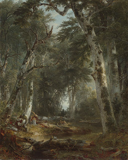
On the other hand, Americans of the mid-1800's were seeing their woods of the West as sacred cathedrals, and so the arching trees became nature's equivalent of the Gothic Cathedral arch. Asher Brown Durand's "In the Woods" (below) "...which feature[s] birches bowed together in Gothic inclination" is a good example of this.


The discovery of the "Big Trees" and other larger-than-life natural elements in Yosemite fostered a growing national sense of the uniqueness of the American Republic and its link as "God's new Chosen People." Schama continues:

A generation earlier the forest had been represented in the popular imagination as the enemy. The eastern woods, after all, had been the habitat of the godless Indian...Beauty lay in clearance; danger and horror lurked in the pagan woods. The clearances were so extensive and so indiscriminate, though, that even as early as 1818 James Madison was protesting the 'injurious and excessive destruction' of timber. To a generation reared on Fenimore Cooper's forest romances, the miraculous appearance of western woodlands seemed to be a sign of God's forbearance, a second chance for America to understand the divinity inscribed in its landscape.

Almost 10 years after Durand's "In the Woods," Hudson Valley painter Worthington Whittredge painted "The Old Hunting Grounds." Again, we have birches used in an architectural way, but this time rising "like fluted columns to the arched, darker foreground trees...an illustration of the tradition which located the origin of Gothic pointed arches and vaults in the spontaneous interlacing of tree limbs." This is much different than Schama's comment about the birches pictured on the cover of Kiefer's book "barring" the way to the deeper woods or Kiefer's outstretched limbs evoking military swords raised in salute. These birches rather remind me of my Wisconsin ones. Kiefer's "barring" ones look like stands I see here in Idaho.

A closer look at Whittredge's and other artists' work of this era reveals they are loaded with additional spiritual associations. These are not just pretty landscapes. A broken stump and trembling birch leaves are emblems of death and new life, for instance.

At least one modern American artist, it seems, can see something more on the lines of Kiefer's "Vargus" in woodland scenes, with a look past the "pretty" exterior revealing deeper levels of understanding. I found this review of Christopher Lowry Johnson on Edward Winkleman's blog - definitely worth your time to pop over and read. What specifically caught my eye was this excerpt from TimeOut New York's full review:
But however romantic Johnson’s painterly style may appear, his scenes are anything but Edenic. The depopulated landscapes convey willful human abandon rather than untouched wilderness and are subtly entangled with contemporary issues of war and environmental disaster.

In the show’s most affecting work, Pines No. 5, Johnson portrays an awkward formation of evergreens, each decked out in Christmas tree lights, boughs heavy with dollops of snow. Softly advancing on the scruffy white ground under a gray-blue haze of twilight, these sad yet beautiful trees suggest an army of soldiers, bravely (or perhaps unwittingly) awaiting their demise. — Jane Harris

Back in the infancy of my blog, I spent several posts analyzing how I see and incorporate nature in my work. I tend to focus on individual lines, shapes, texture, details. If I do take in the whole in any way, I think I have viewed the woods as inviting, the trees dancing, the insulation from the modern world healing. I suppose that last one is a bit of a spiritual connection, but I don't recall sensing any architectural connection.

So what of my many birch quilts? I'm not aware of anything but portraying their appealing shape and stark contrast against various backgrounds that mostly portray seasons or moods: Birches in summer, Birches in the fall, Birches at night. Well, perhaps "Wild on Birch Street" hints at a tree with a bit of attitude as it bursts through a window - a bit of fun there - but I don't think allegory is a part of my interpretations. View some of these quilts in this post on "What to do with Inspiration."

This is making me feel a bit shallow, giving credence to the current argument that too many art quilters are not saying anything important with their work, not making any political statements, not imbuing their work with deeper meaning. Well, I readily concede that much of my work is probably more decorative art than fine art, and I have no problem with that.

Now that I think about it, though, I'm remembering some ideas yet to be executed that will hint at a deeper message for those who take a closer look. I guess they are still ideas because they will be more difficult to pull off, more difficult to work through emotionally than my simple play with lines and color. I've been working up my courage and my technical skill level to start these, and I'm getting closer all the time.

Results of Last Paint Scrunching

I promised to share the results of my little trays of dabbed and scrunched fabric. I really did approach these in a "splash and dash" manner, very unlike me. Just quickly diluted some Setacolor paint, grabbed a variety of fabric scraps and started applying the paint. As a result, I'm hazy about the details of each piece. Some the fabric was wet before applying the paint, others I think I did dry. Some fabric was unbleached muslin and some was very pale peach and pink hand-dyed. I blame you art quilters for influencing me with your more casual approach to experimentation!

To be honest, once the fabric had dried enough to open up, I was pretty disappointed with the results. On most of them, all the paint had run up into the uppermost creases, leaving no color elsewhere, not even in the other scrunched lines. This is not what I remember from the first time I tried this. I wasn't seeing anything of interest. At least, not until I ironed them to heat set them.


Here is how most of them came out. The two pieces on the right are hand-dyes. The navy obviously was too dark, so the red doesn't show up as much. However, on the small light blue one, the red made a nice pinkish impression over it. The one running along the top used red and green paint that was mixed together, then painted over a pale peach hand dye. The one on the left is the same paint over pale pink. Once ironed I could see how the green separated out in places - it looks more brown than green. The top one is a long strip that has a lot of variety to the way the paint migrated. The big one in the middle is unbleached muslin that was dipped dry into the waste water used to clean the foam brush and I really expected more color overall. Instead, it looks like all the paint went into a few areas. There's no fine veining like I got with a previous try at this.

I also had a long narrow strip that I twisted and a shorter fatter one of muslin that I loosely pleated. Again, the paint just didn't do much interesting, or so I thought. As has happened to me before, I saw nothing while each piece was horizontal, but once I turned them vertically, it was a different matter. I'm beginning to wonder if I'm a bit warped because I can manage to see trees and landscapes everywhere. Can you see the pink tree trunk in this one, gently twisting toward the top and splitting into two limbs?


And you get extra points if you see the landscape potential in this one. Think promontory of land jutting into a lake at sunset...