At some point early in my quilting career, someone of authority said it didn't matter if you liked a fabric if it was the color you needed for your quilt. I was skeptical, but inexperienced, and these were the days of a limited selection of quilting fabrics, most being those tiny floral "calicos." I needed a certain golden yellow to depict a small sun in my blocks; the only fabric remotely close was one of those calicos, and I really didn't like it. With the authority's words crowding out my own judgment, I purchased the print and put it in my quilt. The suns were so small, I reasoned, that you really wouldn't see the print, just the right color. However, every time I looked at the finished quilt, my eye went straight to the offending fabric and I was never really happy with it.
A year or so later, I found myself in a similar predicament. This was a more ambitious project needing many more fabrics, but the selection in the stores had only slightly improved. I played it a little smarter this time, bringing home many options. I was playing off a "hearts" theme, so one of those options had tiny hearts on it. Seemed like a good idea at the time. In the end, it was rejected and that is how this fabric, incorporated in my WFW quilt, wound up in my fabric stash.
I rarely work with heart motifs - it's just not me. That's probably why this fabric has been hanging around for so long. Even if it were the right color and value, I would be hesitant to include it because of those hearts, remembering my experience with that first yellow fabric. These "bad" fabric choices are all right for charity quilts, but even then I find I have a hard time using them.
I'm not sure why that "authority" gave the advice she did, or if she still believes it. I just know that it didn't work for me. Once I started teaching, I always told my students to only buy and use fabric they really loved. Otherwise they would run the risk of being disappointed as I was, of their eye always gravitating to the offending fabric. It's worth the time and effort to search for not only the perfect color but also the perfect print or style in a fabric that you love.
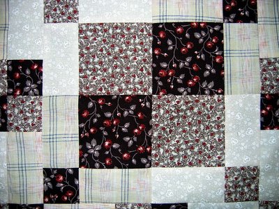
If you look closely, you'll see that the light fabric also has hearts on it. I purchased it for not a lot of money specifically to use in these Warmth from Wisconsin quilts. Each entry has to incorporate a starter block from the store which has an appliqued heart on it. Here we go with the heart theme again. Not my style, but works for this. Makes me a little uncomfortable, but I don't have to live with it. The dark fabric is one I snagged from my guild's bin. No one else wanted to work with it and as a general rule, I like working with browns. The plaid is a Roberta Horton that I found on sale. It is the one fabric in this quilt that I truly love and possibly the only thing that made the constant repetitions of this pattern bearable.
A year or so later, I found myself in a similar predicament. This was a more ambitious project needing many more fabrics, but the selection in the stores had only slightly improved. I played it a little smarter this time, bringing home many options. I was playing off a "hearts" theme, so one of those options had tiny hearts on it. Seemed like a good idea at the time. In the end, it was rejected and that is how this fabric, incorporated in my WFW quilt, wound up in my fabric stash.

I rarely work with heart motifs - it's just not me. That's probably why this fabric has been hanging around for so long. Even if it were the right color and value, I would be hesitant to include it because of those hearts, remembering my experience with that first yellow fabric. These "bad" fabric choices are all right for charity quilts, but even then I find I have a hard time using them.
I'm not sure why that "authority" gave the advice she did, or if she still believes it. I just know that it didn't work for me. Once I started teaching, I always told my students to only buy and use fabric they really loved. Otherwise they would run the risk of being disappointed as I was, of their eye always gravitating to the offending fabric. It's worth the time and effort to search for not only the perfect color but also the perfect print or style in a fabric that you love.
If you look closely, you'll see that the light fabric also has hearts on it. I purchased it for not a lot of money specifically to use in these Warmth from Wisconsin quilts. Each entry has to incorporate a starter block from the store which has an appliqued heart on it. Here we go with the heart theme again. Not my style, but works for this. Makes me a little uncomfortable, but I don't have to live with it. The dark fabric is one I snagged from my guild's bin. No one else wanted to work with it and as a general rule, I like working with browns. The plaid is a Roberta Horton that I found on sale. It is the one fabric in this quilt that I truly love and possibly the only thing that made the constant repetitions of this pattern bearable.
1 comment:
I've never understood that advice either. I've read in a couple of books that we should try to push ourselves out of the comfort zone and put in colours that don't match. I just don't get this AT ALL! My eyes go straight to the things that jar. I don't applaud the maker for being adventurous, I assume the worst (sorry to say!)There are exceptions of course - the quilt may have a message and the colour disharmony part of it but as a rule I prefer harmony!
Post a Comment