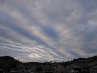
Last weekend I talked about how I see, which somewhat explained how my eye interprets and distills the world around me, registering line, texture and color, the basis of inspiration for my work. I have files bulging with pictures and sketches, and my brain is full as well. Finding images that capture my imagination is not a problem. The hard part is knowing what to do with them. And more often than not, I have no idea how to use all these things that strike me as worth remembering. An excellent case in point are these two pictures of the sky taken several days apart back in October. The cloud formations were unusual enough that I raced back inside for my camera. I have no idea how to use them, but I save them just the same.

At the other end of the spectrum, sometimes I know immediately what I want to do with what I see. The leap between inspiration and interpretation into cloth is short. Such was the case with Willow Leaves, the first in a series of experimental pieces attempting to render a scene from one of my walks. As my eyes beheld the street before me, damp from a recent storm and strewn with willows leaves, the thought, "Autumn confetti!" popped into my head. By the time I returned from the walk, I had a great idea for a quilt and started sketching and planning.
In between the two extremes lies a murky area, where various design elements, techniques and ideas (inspiration) come together in unplanned and often unexpected ways. These are perhaps the most exciting quilts to work on, the ones where I notice I have the least control, but attain the best, most creative results. In these cases, I may start with a germ of an idea, heading in one direction, while my subconscious sifts through my "image files" looking for that bit of inspiration that would work better or solve a problem. When all is done and I look back on the path I took getting there, I marvel that often you never know where you're going until you get there. This is the creative part of the journey. I really like how Sally Collins sums it up in her book, The Art of Machine Piecing:
For me, replication is often the most obvious way to interpret inspiration, and I get stuck there. (Must be all those years of making traditional quilts where replication of block patterns was the norm.) I'm not saying there's anything wrong with working that way, but it's not always the result I want or have the skill to achieve. Yet I can't see past that solution onto something that would satisfy my need to create in fabric in a different way. I crave a little literary license as it were. Lifting an element should come more easily to me - that has been my experience when choosing quilting designs for my traditional quilts, for instance. Something about using nature as inspiration, though, throws me right back to that literal interpretation thing. I discovered that sketching rather than photographing, or sketching from a photograph or painting can help me break out of that, since my drawing skills are very limited. As for distilling the essence, mastering that is something that I think would move my work forward tremendously.
Underlying all this is mastery of technique - many techniques. The best idea in the world, the most perfect design idea, the edgiest vision is nothing without the proper means to execute it. A few years ago when the highway department started cutting trees in preparation for building a bypass highway through my beloved woods, I happened upon one of my birches, lopped off near its base. Wood chips were strewn all about the stump, and the gleaming white trunk lay at an angle where it fell. Ok, it was just a tree, but I was stunned and saddened. The idea for a quilt called "Bypass Fallout" began to form. I knew of just the piece of hand-dyed fabric for its background. It had been folded such that the dye created a pattern not unlike three fir trees. My vision was to enhance that image with thread embellishment, but I had no experience in that technique and didn't know how to go about it. I thought of other details to enhance my design, not knowing how to execute them either, so the quilt has had to wait until I learned and mastered the techniques necessary. I think I'm at that point now, or close enough. I am ready to take a crack at moving from point A to point B.
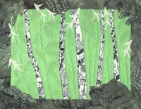
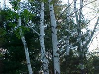
I spent a year making journal quilts with a friend - not part of the official journal project, but certainly inspired by it. I used that discipline to try out ideas and techniques to take my newfound nature inspirations into reality. Some of them are good examples showing the link between what I see and how to use it. Below is one of the first ones I did, coupled with the photograph used for inspiration. You can see how I copied the birch trees almost exactly from the photo, my main goal to capture their subtle curves. I couldn't think of anything else to do but be fairly representational, but instead of trying to duplicate the background foliage as well, I just quilted in some simple lines to represent the essence of other trees. The bright green background was an attempt to match that fresh new leaf green that was evident everywhere at the time I made the quilt. It wasn't part of the original photograph, but an element lifted from a separate image. This was how I took line, texture and color inspirations from A to B.
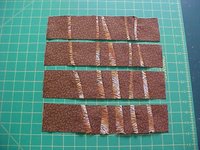
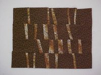
Later that year, when the trees started coming down, I used this same design as the basis of a new idea and technique. I was decidedly angry and depressed and there wasn't a thing I could do about what was happening. I suddenly thought, as long as everyone else is chopping up my trees, I guess I may as well too. I pieced the trunks into the background, taking my color cues from the tans and browns of the wood chips and exposed earth. Then I sliced the piece into random width sections, rearranged them and sewed them back together. This effectively moved me away from a literal translation of the chopped up trees into expressing the essence of the idea through metaphor. (As an aside, I found this process uncomfortable because of the lack of control over the outcome, but I must admit it produced design lines and relationships I would not have drawn if left to my own devices. The source of my discomfort was rooted in my belief that, since I was not responsible for the final result, I shouldn't take credit for it. Me and my control issues.) For the quilting, I tried to replicate the look of the wood chips as texture, lifting that one image from the overall theme to use more literally.


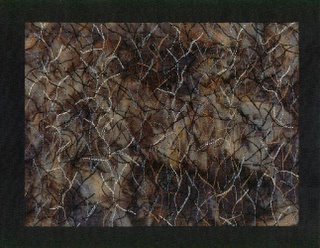
Speaking of texture, I find it very difficult to figure out how to incorporate the texture I see into a textile piece. Again, I seem to have a difficult time being more imaginative than just creating it with quilting or thread painting in a mostly literal sense. I'm just beginning to think how beading, stamping, painting and other fabric manipulation could do that. But back when I was doing this next journal quilt, I was still stuck at threads in my attempt to distill the essence of the texture I saw in a stand of trees, devoid of any leaves or snow. I used several colors of threads to quilt over one of my favorite batiks, my mind thinking vertically like the trees, with a few deviations left and right for the branches. This was very unsatisfying. I realized I'd been using this vertical tree line for quilting on several of my journal quilts and I needed to break out of that thinking. So the last layer of texture was quilted horizontally, which seemed to do the trick to make it more interesting.
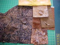
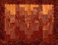
Every now and then I experiment with bringing color from the natural world into the studio in order to find a match from my stash. I have so many dried autumn leaves at my disposal that it is ridiculous; I can't seem to stop picking up the red and yellow ones on my walks. One day I had paused while the dog continued her "hunting" and eventually looked down at my feet. The ground was covered with brown leaves. Ugh, I thought, how boring. On closer inspection, I noticed that the "just brown" leaves actually represented a wide range of browns, some with red undertones, some more yellow, some very pale and others quite dark. I picked up an assortment and headed back to the studio. The picture below shows the leaves matched to fabrics and the resulting journal quilt. More metaphor here: My father-in-law had recently died. The decaying leaves reminded me not only of death but rebirth as they add nutrients to the soil for future plant life. The gradation of colors to the yellow represents the transition from death to the afterlife. Wavy vertical quilting lines complete the theme of "Spirits Ascending." I apologize for the quality of the scan. It's much redder than the actual piece. The colors in the fabric selection photo are a little truer.
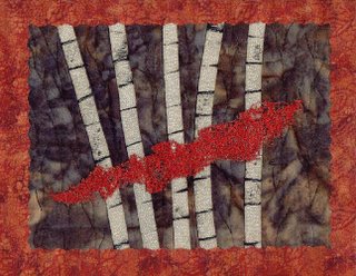
Another example of using color from nature is this more representational journal quilt which shows how I sometimes see color in swathes. It was nearly dusk when I caught this flash of red out of the corner of my eye. What in the heck is that, I wondered, as I turned to take a closer look. Instead of something solid, the red was composed of many leaves along a branch with those birches as a backdrop. In the fading light, the branch itself was barely visible, and the leaves seemed to float like chiffon in mid-air. So in my rendition, I do not depict the individual leaves, but the essence of the effect they made collectively.
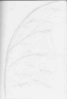
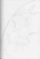
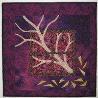
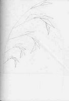
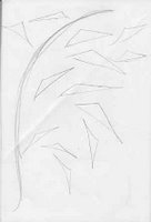
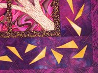
In these previous examples, I had at least some idea of what I wanted to do with a particular inspiration. I took that inspiration and built a quilt around it. Often I can't figure out what to do with an image, try as I may. I put it aside and much later it may be incorporated into another idea lacking a certain element. That's that murky area I spoke of earlier. That's how "Wild on Birch Street" went from a problem design to a problem solved. I'd gotten stuck with a balance issue. I needed something to go in the lower corner to offset the tree branches thrusting through the upper left of the window. Every solution I came up with seemed trite and predictable (cat looking out the window, vase on a table). I sought advise from the AQL group. I believe it was Margaret who suggested introducing free-cut triangular shapes that could also be interpreted as leaves. That set off a lightbulb in my head and sent me to my sketchbook. Months earlier I'd noticed grass that had angular seed heads; the curve of the stem coupled with the angles intrigued me and I came home to play with the idea. Here are four of the six sketches I made that day, but I felt I was going nowhere - not having a complete concept. Now I could see how I could lift the triangle shapes that started as seeds and transform them into a design element suggesting leaves. Some of the triangle shapes ended up in the quilting as well.
And what about subliminal intervention, that knowledge you don't even realize is influencing your work? I often wonder if the reason why so much of my work is dark, that I instinctively reach for darker values for backgrounds, is because of where I grew up. My little town was nestled in a narrow canyon whose steep faces were dense with pines which created a rich dark backdrop to my daily comings and goings. The mountains cast early shadows. Tamaracks turned yellow in fall and the maples turned a brilliant red or orange, colors I use consistently in my work when my brain isn't in overdrive. I'm drawn to fabrics with those colors so much so that friends & relatives describe quilts or textiles they think I'd like as being in "my colors."
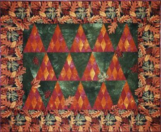
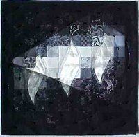
Probably the best example I have at the moment of subliminal intervention, though, would be "Darkness Has Not Overcome It," my first real attempt at an art quilt. It was the result of an AQL challenge to work with 4 randomly picked words from a list generated by the participants. My words included "light" and "evening" and my original sketches revolve around a single flame. Yet once I started working with fabric, I realized with a start that two more flames had appeared and wouldn't go away. Eventually, I figured it out - my religious background had worked its subtle way into the design. What began with the idea of showing a single light in evening dusk morphed into a symbolic representation of the Trinity and the scripture from John 1:15: "The light shines in the darkness and the darkness has not overcome it." I deemed it subliminal intervention at a time when I was recovering from a major loss and needed assurances.
So that's my story. The more I think about seeing and interpreting and creating, the more I realize what I've covered here is only the tip of the iceberg. The journey is indeed long and can be delightfully so. There is so much to learn and experience, so many ideas to convert into cloth.


At the other end of the spectrum, sometimes I know immediately what I want to do with what I see. The leap between inspiration and interpretation into cloth is short. Such was the case with Willow Leaves, the first in a series of experimental pieces attempting to render a scene from one of my walks. As my eyes beheld the street before me, damp from a recent storm and strewn with willows leaves, the thought, "Autumn confetti!" popped into my head. By the time I returned from the walk, I had a great idea for a quilt and started sketching and planning.
In between the two extremes lies a murky area, where various design elements, techniques and ideas (inspiration) come together in unplanned and often unexpected ways. These are perhaps the most exciting quilts to work on, the ones where I notice I have the least control, but attain the best, most creative results. In these cases, I may start with a germ of an idea, heading in one direction, while my subconscious sifts through my "image files" looking for that bit of inspiration that would work better or solve a problem. When all is done and I look back on the path I took getting there, I marvel that often you never know where you're going until you get there. This is the creative part of the journey. I really like how Sally Collins sums it up in her book, The Art of Machine Piecing:
"I have learned that I do not actually "create anything" new, but rather I take inspiration from the things I see around me, from events that happen to me, or often from serendipity...The creative process is one of pulling various existing parts into a new or different whole. It is not originating, or creating the parts and the whole, as much as it is noticing and orchestrating the beauty that is already all around us."That's all pretty general information. Now let me be a little more specific about how one gets from point A (inspiration) to point B (interpretation or finished work). I'm finding it difficult to organize my thoughts on this into hard & fast categories, but here's one way to look at it. My personal experience tells me it can happen in four ways: 1) Literal interpretation or replication; 2) lifting an element - shape or color or texture - to add to an unrelated design; 3) distilling the essence to use in a non-representational way or metaphorically; 4) subliminal intervention. Of course, there are times when these arbitrary categories work together in a piece. For instance, a lifted element can be used either literally or distilled. A color combination may appear for no accountable reason, except that somewhere in the recesses of your memory it has been stored without your knowing it, to surface instinctively, subliminally. These are not hard and fast rules here, nor the only paths but at least a place to start.
For me, replication is often the most obvious way to interpret inspiration, and I get stuck there. (Must be all those years of making traditional quilts where replication of block patterns was the norm.) I'm not saying there's anything wrong with working that way, but it's not always the result I want or have the skill to achieve. Yet I can't see past that solution onto something that would satisfy my need to create in fabric in a different way. I crave a little literary license as it were. Lifting an element should come more easily to me - that has been my experience when choosing quilting designs for my traditional quilts, for instance. Something about using nature as inspiration, though, throws me right back to that literal interpretation thing. I discovered that sketching rather than photographing, or sketching from a photograph or painting can help me break out of that, since my drawing skills are very limited. As for distilling the essence, mastering that is something that I think would move my work forward tremendously.
Underlying all this is mastery of technique - many techniques. The best idea in the world, the most perfect design idea, the edgiest vision is nothing without the proper means to execute it. A few years ago when the highway department started cutting trees in preparation for building a bypass highway through my beloved woods, I happened upon one of my birches, lopped off near its base. Wood chips were strewn all about the stump, and the gleaming white trunk lay at an angle where it fell. Ok, it was just a tree, but I was stunned and saddened. The idea for a quilt called "Bypass Fallout" began to form. I knew of just the piece of hand-dyed fabric for its background. It had been folded such that the dye created a pattern not unlike three fir trees. My vision was to enhance that image with thread embellishment, but I had no experience in that technique and didn't know how to go about it. I thought of other details to enhance my design, not knowing how to execute them either, so the quilt has had to wait until I learned and mastered the techniques necessary. I think I'm at that point now, or close enough. I am ready to take a crack at moving from point A to point B.
I spent a year making journal quilts with a friend - not part of the official journal project, but certainly inspired by it. I used that discipline to try out ideas and techniques to take my newfound nature inspirations into reality. Some of them are good examples showing the link between what I see and how to use it. Below is one of the first ones I did, coupled with the photograph used for inspiration. You can see how I copied the birch trees almost exactly from the photo, my main goal to capture their subtle curves. I couldn't think of anything else to do but be fairly representational, but instead of trying to duplicate the background foliage as well, I just quilted in some simple lines to represent the essence of other trees. The bright green background was an attempt to match that fresh new leaf green that was evident everywhere at the time I made the quilt. It wasn't part of the original photograph, but an element lifted from a separate image. This was how I took line, texture and color inspirations from A to B.


Later that year, when the trees started coming down, I used this same design as the basis of a new idea and technique. I was decidedly angry and depressed and there wasn't a thing I could do about what was happening. I suddenly thought, as long as everyone else is chopping up my trees, I guess I may as well too. I pieced the trunks into the background, taking my color cues from the tans and browns of the wood chips and exposed earth. Then I sliced the piece into random width sections, rearranged them and sewed them back together. This effectively moved me away from a literal translation of the chopped up trees into expressing the essence of the idea through metaphor. (As an aside, I found this process uncomfortable because of the lack of control over the outcome, but I must admit it produced design lines and relationships I would not have drawn if left to my own devices. The source of my discomfort was rooted in my belief that, since I was not responsible for the final result, I shouldn't take credit for it. Me and my control issues.) For the quilting, I tried to replicate the look of the wood chips as texture, lifting that one image from the overall theme to use more literally.


Speaking of texture, I find it very difficult to figure out how to incorporate the texture I see into a textile piece. Again, I seem to have a difficult time being more imaginative than just creating it with quilting or thread painting in a mostly literal sense. I'm just beginning to think how beading, stamping, painting and other fabric manipulation could do that. But back when I was doing this next journal quilt, I was still stuck at threads in my attempt to distill the essence of the texture I saw in a stand of trees, devoid of any leaves or snow. I used several colors of threads to quilt over one of my favorite batiks, my mind thinking vertically like the trees, with a few deviations left and right for the branches. This was very unsatisfying. I realized I'd been using this vertical tree line for quilting on several of my journal quilts and I needed to break out of that thinking. So the last layer of texture was quilted horizontally, which seemed to do the trick to make it more interesting.

Every now and then I experiment with bringing color from the natural world into the studio in order to find a match from my stash. I have so many dried autumn leaves at my disposal that it is ridiculous; I can't seem to stop picking up the red and yellow ones on my walks. One day I had paused while the dog continued her "hunting" and eventually looked down at my feet. The ground was covered with brown leaves. Ugh, I thought, how boring. On closer inspection, I noticed that the "just brown" leaves actually represented a wide range of browns, some with red undertones, some more yellow, some very pale and others quite dark. I picked up an assortment and headed back to the studio. The picture below shows the leaves matched to fabrics and the resulting journal quilt. More metaphor here: My father-in-law had recently died. The decaying leaves reminded me not only of death but rebirth as they add nutrients to the soil for future plant life. The gradation of colors to the yellow represents the transition from death to the afterlife. Wavy vertical quilting lines complete the theme of "Spirits Ascending." I apologize for the quality of the scan. It's much redder than the actual piece. The colors in the fabric selection photo are a little truer.


Another example of using color from nature is this more representational journal quilt which shows how I sometimes see color in swathes. It was nearly dusk when I caught this flash of red out of the corner of my eye. What in the heck is that, I wondered, as I turned to take a closer look. Instead of something solid, the red was composed of many leaves along a branch with those birches as a backdrop. In the fading light, the branch itself was barely visible, and the leaves seemed to float like chiffon in mid-air. So in my rendition, I do not depict the individual leaves, but the essence of the effect they made collectively.

In these previous examples, I had at least some idea of what I wanted to do with a particular inspiration. I took that inspiration and built a quilt around it. Often I can't figure out what to do with an image, try as I may. I put it aside and much later it may be incorporated into another idea lacking a certain element. That's that murky area I spoke of earlier. That's how "Wild on Birch Street" went from a problem design to a problem solved. I'd gotten stuck with a balance issue. I needed something to go in the lower corner to offset the tree branches thrusting through the upper left of the window. Every solution I came up with seemed trite and predictable (cat looking out the window, vase on a table). I sought advise from the AQL group. I believe it was Margaret who suggested introducing free-cut triangular shapes that could also be interpreted as leaves. That set off a lightbulb in my head and sent me to my sketchbook. Months earlier I'd noticed grass that had angular seed heads; the curve of the stem coupled with the angles intrigued me and I came home to play with the idea. Here are four of the six sketches I made that day, but I felt I was going nowhere - not having a complete concept. Now I could see how I could lift the triangle shapes that started as seeds and transform them into a design element suggesting leaves. Some of the triangle shapes ended up in the quilting as well.


And what about subliminal intervention, that knowledge you don't even realize is influencing your work? I often wonder if the reason why so much of my work is dark, that I instinctively reach for darker values for backgrounds, is because of where I grew up. My little town was nestled in a narrow canyon whose steep faces were dense with pines which created a rich dark backdrop to my daily comings and goings. The mountains cast early shadows. Tamaracks turned yellow in fall and the maples turned a brilliant red or orange, colors I use consistently in my work when my brain isn't in overdrive. I'm drawn to fabrics with those colors so much so that friends & relatives describe quilts or textiles they think I'd like as being in "my colors."

Probably the best example I have at the moment of subliminal intervention, though, would be "Darkness Has Not Overcome It," my first real attempt at an art quilt. It was the result of an AQL challenge to work with 4 randomly picked words from a list generated by the participants. My words included "light" and "evening" and my original sketches revolve around a single flame. Yet once I started working with fabric, I realized with a start that two more flames had appeared and wouldn't go away. Eventually, I figured it out - my religious background had worked its subtle way into the design. What began with the idea of showing a single light in evening dusk morphed into a symbolic representation of the Trinity and the scripture from John 1:15: "The light shines in the darkness and the darkness has not overcome it." I deemed it subliminal intervention at a time when I was recovering from a major loss and needed assurances.

So that's my story. The more I think about seeing and interpreting and creating, the more I realize what I've covered here is only the tip of the iceberg. The journey is indeed long and can be delightfully so. There is so much to learn and experience, so many ideas to convert into cloth.
2 comments:
Following your thoughts and progress makes fascinating reading! The trinity quilt is beautiful.
Finally had a chance to actually read this post. Interesting and very cool about our similar interpretation of trees!!!!
Post a Comment