Yesterday was much better. Still cold but at least the wind had died down and with it my nervousness and sluggishness. I finished quilting the border of the pinwheel top and also along the trunks in the center. All that's left is a little free motion quilting and it will be ready for the binding.
Speaking of binding, I continued pulling and eliminating fabric for Grid 2 binding. This wasn't on my list of goals for the week, but there certainly was time to fool with it. I'm a bit puzzled; I tallied up my time for the week and while I showed up my minimum of 4 days, I fell short of my minimum number of studio hours by a few. Yet I met all my stated goals and did extra. And I thought I was pushing it with my little list. Guess I should feel pretty good that I could accomplish more than I anticipated, even when not up to snuff on every day.
I thought choosing binding for Grid 2 might go fairly quickly, but as usual, the more fabric I got out, the more confused I think I made myself. Annabel commented on this post that Pauline Burbidge said, "putting something up on a wall and just looking at something for days on end wasn't prevaricating, or obsessing, just making decisions." Ah, thank you Annabel! That thought made today's "prevaricating" more enjoyable. Here's how it went.
I started by pulling from my batiks - several browns, several plums and pinks, and an odd turquoise & plum one just in case. My head thought the browns would probably do it - something dark to frame things and balance out the brown of the threads. But I also thought a strong dark pink or plum would make the pink in the squares take prominence, which would be a good thing. Blue just never occurred to me, but I like to keep those options open.
The next day I viewed my selections in the sun that was streaming onto the work table. With about a binding's width showing around the edge of the quilt, I auditioned each fabric, eliminating all but 5. The plums looked fabulous, the browns disappointing and that blue/plum one surprisingly good. I found myself really drawn to it, so figured it was time to put it up on the design wall. That way I could see it fresh the following day.
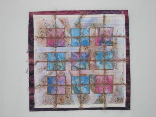
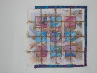
So yesterday, after getting the quilting done, I started playing with these fabrics on the design wall. Now with no sunlight on them, they read totally different. The fabulous plums just looked dark and boring:
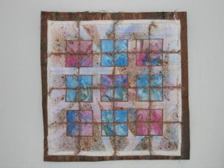
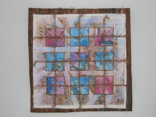
The browns only highlighted the brown spatters in the background fabric of the quilt - something I was trying to downplay:
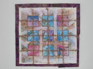
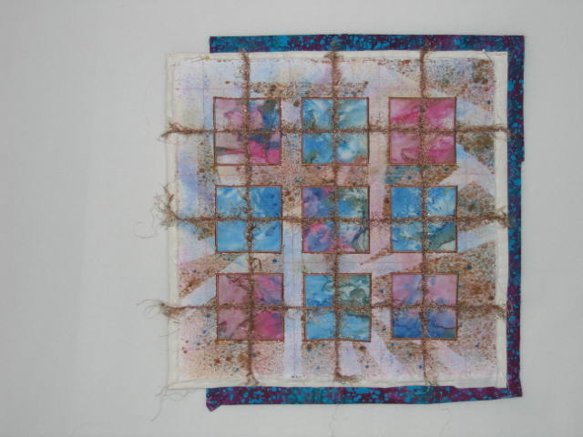
But that blue/plum still read interestingly and made my eyes focus on the squares:
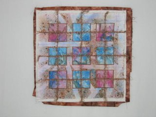
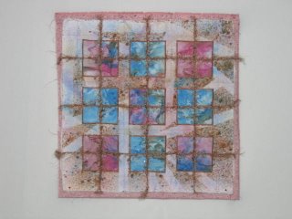
Of course, I couldn't be satisfied with that. Pink was still on my mind, so I dug through my regular stash to see what I could find. This pink is a commercial spatter print, which goes well with the background fabric, but I tend to think it is too light:
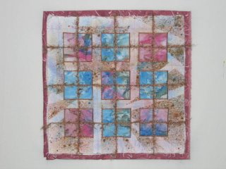
This pink is close to what I had in mind, but the print doesn't have the right feel to go with the top:
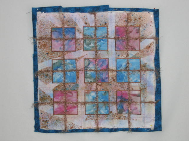
I found this blue which I think looks good - it is somewhat mottled with black:

But I keep going back to that blue/plum. What do you think? (Click on pics for a larger view.)
In the meantime, my studio has stacks of fabric everywhere until I make my final choice. Thank goodness, the pinwheel quilt is getting a black binding...unless I start prevaricating again...
Speaking of binding, I continued pulling and eliminating fabric for Grid 2 binding. This wasn't on my list of goals for the week, but there certainly was time to fool with it. I'm a bit puzzled; I tallied up my time for the week and while I showed up my minimum of 4 days, I fell short of my minimum number of studio hours by a few. Yet I met all my stated goals and did extra. And I thought I was pushing it with my little list. Guess I should feel pretty good that I could accomplish more than I anticipated, even when not up to snuff on every day.
I thought choosing binding for Grid 2 might go fairly quickly, but as usual, the more fabric I got out, the more confused I think I made myself. Annabel commented on this post that Pauline Burbidge said, "putting something up on a wall and just looking at something for days on end wasn't prevaricating, or obsessing, just making decisions." Ah, thank you Annabel! That thought made today's "prevaricating" more enjoyable. Here's how it went.
I started by pulling from my batiks - several browns, several plums and pinks, and an odd turquoise & plum one just in case. My head thought the browns would probably do it - something dark to frame things and balance out the brown of the threads. But I also thought a strong dark pink or plum would make the pink in the squares take prominence, which would be a good thing. Blue just never occurred to me, but I like to keep those options open.
The next day I viewed my selections in the sun that was streaming onto the work table. With about a binding's width showing around the edge of the quilt, I auditioned each fabric, eliminating all but 5. The plums looked fabulous, the browns disappointing and that blue/plum one surprisingly good. I found myself really drawn to it, so figured it was time to put it up on the design wall. That way I could see it fresh the following day.
So yesterday, after getting the quilting done, I started playing with these fabrics on the design wall. Now with no sunlight on them, they read totally different. The fabulous plums just looked dark and boring:


The browns only highlighted the brown spatters in the background fabric of the quilt - something I was trying to downplay:

But that blue/plum still read interestingly and made my eyes focus on the squares:
Of course, I couldn't be satisfied with that. Pink was still on my mind, so I dug through my regular stash to see what I could find. This pink is a commercial spatter print, which goes well with the background fabric, but I tend to think it is too light:

This pink is close to what I had in mind, but the print doesn't have the right feel to go with the top:

I found this blue which I think looks good - it is somewhat mottled with black:
But I keep going back to that blue/plum. What do you think? (Click on pics for a larger view.)
In the meantime, my studio has stacks of fabric everywhere until I make my final choice. Thank goodness, the pinwheel quilt is getting a black binding...unless I start prevaricating again...
5 comments:
Mmm, I like this Sheila! I like the plum too but the blue really brings out the blue in the squares. I like the effect the pink has on it too but I guess you'd have to take into account what the border does to it, being so light. I'm hopeless at making decisions as you can tell...!
I think I must be getting my borders and binding mixed up!! Actually I like the pink - and I'm not normally drawn to that colour.
I like the darker brown, it adds contrats
I like the pink too -- the darker, second one. The blues in the grid really stand out then. The other color bindings pull too much attention out to the binding, but the pink makes the grid stand out which is what you want, right? At least that's how it seems in the photos, but you've got the works right there, hopefully we're seeing about the same thing. I don't see a problem with the print of the pink.
This is the fun part I think, finding the perfect last thing that makes the whole piece come together and sing. Not to be taken lightly!
I like the blue plum. I think I'd like the pink too, if it was a bit darker. For what it's worth!
Post a Comment