Monday, June 30, 2008

Sacrifice?

I'm not sure I should admit this publicly, but a little soul searching leads me to only one conclusion: I've been lax, lazy and inattentive in regards to my quilting, and it's high time that it stops. Oh, I've had spurts of motivation, inspiration and industriousness, but nothing that I've worked to sustain for any length of time. I'm trying to rectify that over the next two weeks, really focus and really put in the time every day to bring several works to completion and get my latest idea off the ground by starting several new quilts. I think I've hit that point where I have to consciously shut out all distractions, be ruthless in protecting studio time, get back into the habit of getting in there and getting down to business. The world, for the most part, will have to wait. This is something recommended by Twyla Tharp in her book "The Creative Habit" where she notes, "The act of giving something up does not merely clear time and mental space to focus you. It's a ritual too, an offering where you sacrifice a portion of your life to the metaphoric gods of creation." OK, the sacrifice begins today!


Funny, it didn't feel like sacrifice, though. It felt familiar, comfortable, normal. It began with something quite mundane but necessary as a first step in my azalea palette project: Washing and ironing fabric. Not every part of the creative process is glamorous, nor does it involve sitting at a machine or wielding a needle or paint brush. Some of it is prep work akin to grunt work. Lucky for me I rather enjoy processing fabric. Here you see two greens I bought specifically for backgrounds for the mosaic idea. The orange is a batik I'd purchased back in May that just happens to fit the palette I'll be working with. I have the rest of my unwashed fabric from recent purchases clipped, labeled and sorted into piles ready to go through the washing machine. (It's hard to get going on an idea when the fabric isn't ready to play...)


While waiting for the washing machine to run through its cycles, I pulled my March TIFC off the design wall - time to quit prevaricating and move forward. I'm trying a different way of edge finish which will create a border after the quilting is done and wanted to mark where the edge of the border will fall. I'd placed pins like cropping marks, but they can't stay once layering and quilting begins. I decided some quick long basting stitches would adequately mark the line and put them in by hand. Then I threaded up the machine and tacked the lichen in place. I made a last adjustment to the sheer leaf print positions and fused them down. There! This one is now ready for layering.

Thinking about how the session went, I was reminded of several things. First and foremost, I really do like having more than one piece going at one time. I like being able to jump from one to another as time and inspiration permit. However, there comes a time when I tire of having so many half-finished projects cluttering up every available space. Second, I need to be willing to do what I have to do to get to where I want to go. Isn't that what all the experimenting is about, all the trial and error with different techniques and materials? Some of it is not my favorite thing to do, but is the best way to get the effect I want or aide my efforts. And isn't this what "doing the work" is all about as well, putting in the time even when it's not convenient?

I polished off my work day following lunch, basting on my applique for 1/2 an hour while sitting in the shade of a tree. Yup, it didn't feel like sacrifice at all. Tomorrow may be different.

Sunday, June 29, 2008

A Question For You

I hesitate to mention it, for fear of jinxing it, but it would appear that summer has finally arrived here in Northern Idaho. Temps in the 90's this weekend make sitting in the shade of my various old trees a pleasure I cannot resist. I take my lunch outside any day remotely nice enough for it, but this last week the problem has been convincing myself to come back inside once the meal consumed and a little reading done. The exceptionally long winter and near non-existent spring may have something to do with it. With all I always have waiting for me to attend to (inside, of course), I need justification to stay outside longer. So I've been filling the time with handwork - for the moment, the basting in preparation for appliqueing vines on sashing and borders (something else that can be done outside).

That particular project, though, is not as high on my priority list as some others. I still need to put time in the studio, and am doing that (a bit begrudgingly) in the mornings. I'm still anxious to get going on my azalea palette idea, but feel the need to first machine quilt two smaller pieces that have languished long enough. Fortunately, the idea for using those colors in a mosaic format will incorporate hand applique, something I can take outside once the prep work is done. I've decided to allot a bit of that morning studio time this week to get it to that point.

I was thinking all this through this afternoon, which led to me wondering, how do people who do all their work by machine find ways to spend time outside on lovely days and still make progress on their art? I knew of one lady who, once summer arrived, hauled her sewing machine and its table outside under a tree, strung a long extension cord and sewed away.

So my question to you, whether you do all your work by machine or not, or practice any art form that would normally keep you inside, is this: What clever ways have you come up with to enjoy the nice weather sans guilt, sans lack of productivity?

Friday, June 27, 2008

Someone Knows Me Too Well...


This envelope arrived in yesterday's mail. I couldn't imagine what my friend was sending me - it felt like a sheaf of newspaper clippings, or maybe some fabric. But no - it is real birch bark that she peeled off a tree near her home. because it made her think of me and my "affinity to birch trees." I've peeled small strips on occasion, but have never been able to get the big pieces like this. Thanks!


Oh, and she added that I don't have to use it. Mmm, maybe she doesn't know me well. I've experimented with different ways to attach birch bark to cloth because I'd like to incorporate real bark on a piece I have in mind. The picture above is my January 2004 journal quilt trying one method that I didn't care for (fusible web - the heat of the iron turned the white surface tan). Is this the prod I need to haul out the fabric and proceed?

Thursday, June 26, 2008

Good News, Bad News, Good News...


The good news is, I got a call that my sewing machine was ready to pick-up. Whoo Hoo! I rushed right out to get it, even though this disrupted my time in the studio. But how could I resist getting it back so I could finish up my totebag. Here it is, looking really cute, I think. I set my Viking Sapphire at leather settings to punch my way through the multiple layers attaching straps to body; it barely complained, although it did skip a few stitches in the toughest places - I chalk that up to the adhesive on the fusible fleece, which by the way, gives the bag very nice body.


Here's the inside of the bag, showing the french seam that totally encases the raw edges of the sides. To make a french seam, you sew wrong sides together first, turn inside out, then sew a second seam slightly wider than the first. If you click on the picture, you may be able to see the line of stitching that creates the box bottom.

So what's the bad news, you may be wondering? The repairman couldn't find anything wrong with my machine, couldn't make it do what it was doing to me. Oh, I am not surprised, seems to be my luck to always have intermittent problems that no one else is experiencing. He even called Viking to inquire and they were clueless as well. I guess I will have to do more careful troubleshooting to see if I can pin down exactly how it is set up when I have the problem. The good news? He didn't charge me anything, since there was nothing to fix and nothing to clean. In fact, he said it shouldn't need a servicing for several more years based on what he saw inside. I thought I'd sewn a lot with it, but I'm pretty diligent about cleaning out the lint on a regular basis. Not the first time a repairman has told me there was little lint lurking in the works.


Once I finished up the totebag, I returned to my original plan for the day. Here is the top border for my exchange block quilt. I spent some time on the computer trying out different fonts for the lettering and printing out samples. It immediately became clear that this lettering is too small to easily hand applique, and I don't want to fuse the letters down because all the rest of the applique in the quilt is hand done. So now I'm thinking I'll stencil them on with either acrylic paint or Paintstiks.
That's one reason the center isn't traced over with the Sharpie pen yet . The other is that I'm still playing with ways to resolve the ends of the vines. If you click on the picture for the larger view, you can see that I've penciled different ideas over the top of one another which makes it very hard to envision how each would actually work. I eventually remembered I had some sheets of clear plastic, and traced three different versions on it. That way I can erase those pencil lines and overlay the various options on the sheets to audition the effects.

Wednesday, June 25, 2008

A bit of Frivolity


Since I'm still in that mode of working on a project for which there's nothing new to share, I'm sharing instead this sculpture installation located in downtown Sandpoint. The rabbit amuses me so. But he is just one part of it.


Here's the two pieces that comprise this work, named "Pace Yourself" by Bob Lindemann I believe. I couldn't find anything about him or this work on the Internet. I can tell you that the crow is not a part of it. He flew in just as I took the picture.

I find this pretty good advice, by the way. As I continue to wait for my machine to be repaired, I've calmed myself about all I COULD be getting done if I had it back, and busied myself with those lower priority items I find difficult to make time for - even now. The weather has been so lovely that I've spent the last two afternoons sitting outside basting the last of the applique sashings for my cousins exchange block quilt. Earlier today, I got out the border strips I'd started designing at the retreat, resolved the turn of the vine at the corners and drew out the top border. Now to find some lettering I like to spell out "Cousins" for the center of the top border.

Tuesday, June 24, 2008

What is it?


I ran across the above in a magazine - it's an ad for a product...can you guess what that product is?

I share this to show that design inspirations can come from nearly anywhere. Any idea what it is yet?

My first thought was, "That would make a great stencil for painting fabric." I also liked the way the design was slightly tilted, and thought about piecing and applique possibilities. But what is it?

If I use it, I probably would eliminate or modify the outer ring. But the rest of it has lines I really like, whatever it is.

Figure it out yet? I'm guessing probably not, unless you're a mechanic or into motorcycles. The ad was in my Roadracing World magazine and that is the inner workings of a motorcycle brake.

Monday, June 23, 2008

A Peek at ArtWalk 2008 Opening


Friday was the opening reception at all locations of ArtWalk 2008 in Sandpoint, ID. More than one person confirmed what I already knew - that I had the best location. You can see from the picture above that Taylor-Parker Motor Company does indeed have a very visible place in which to display art. The street running in front of it is one way, and everyone traveling north on Hwy 95 into Sandpoint has to drive right past those windows. Initially, I was a little concerned about direct sun, but I was assured that by this time of year, the sun is too high in the sky to hit the wall directly. All that natural light shows the quilts off wonderfully.


I had such a fun time standing with my quilts, watching people's reactions, overhearing comments, accepting direct feedback and answering questions. I must admit it was a bit nerve racking watching so many people pause to touch them. Unlike quilt shows, there's no "white glove" angels or signs requesting to keep your hands off. One husband even grabbed the corner of one quilt and pulled it back to find the label - then explained his wife was a quilter and he knew all about looking for information on the back. But apparently not about keeping your hands off! No matter, I took it as a compliment and assured several guilty-looking apologetic people that it's natural to want to touch something so tactile.


That hallway where my quilts hang is very narrow, so it was a bit of a trick for people to view them while others were trying to pass through. As some walked quickly by, the larger quilts waved away from the wall in the movement of air stirred up with their passing. Boy, was I glad I puttied those dowels to the pushpins!


The Papier Mache people were so much fun as was their art. They were at the opposite end of the hall from me, but they kept wandering down and engaging me in conversation. Here is what part of their display looked like from outside.


Their work definitely drew people inside who then proceeded down the hallway to view my work.


It was a little lonely down on my end of the hallway at times, but these fellows kept me company. I believe this is called "Singin' the Blues between the Lines." It was my favorite piece. I loved it when one of the Papier Mache people led a lady dressed in a zebra-striped shirt down to view it. It took her a minute to get it - that art was imitating life & vise versa - but once she did, she agreed to have her picture taken with it.


The 3-dimension aspect of this piece isn't readily evident from the straight-on picture. Here you can see how the heads stick out fully from the base.


Their art took many forms. For my Wisconsin friends, note the cows, done much like the zebras.


There were many pieces that took human form - some of the work reminded me of soft sculpture doll art. But there were abstract pieces as well.


This could not have been a better kick-off to summer - it was such a warm lovely evening. The streets were full of art (and wine) lovers. Pend d'Orielle Winery across from us was a favorite stop.


And this is Timber Stand Gallery kitty-corner from my venue. People obviously were enjoying being out and about and connecting with friends while viewing a wide variety of local art. It was all supposed to be over by 8:00 p.m. but the revelers refused to go home!

Saturday, June 21, 2008

And now for a little fun...


With my main machine in the shop, I've had to put several projects on hold. That's the bad news. The good news is that it frees me up to work on a fun no stress project. It started with the squares above - a fabric my friend LeAnn brought along to the retreat and generously shared. They read, "In my head my thighs are thin, my stomach is flat, and my chest is tan. I live a good fantasy life." and "Your butt's not big. The rest of you is just too small." Yes, yes - they resonate!


I really had no idea what I might do with these until I thought they'd make good pockets on the outside of a totebag. Aha! I was sure I could find fabric in my stash to go along and maybe create a summer beach theme. Here you see me sewing the squares to lining fabric - I stitched about 1/8" away from the printed edge of the square so that a small amount of the blue would show once they were turned inside out.


Here's the finished pocket with the rest of the fabric. I'm using a pattern from the Nov/Dec 2004 issue of Fons & Porter Love of Quilting. And of course, don't have exactly what it calls for, like double faced pre-quilted fabric. Who needs pre-quilted fabric? I can make my own, right? That's two coordinating fabrics from a line of Jennifer Sampou fabric that is easily 8 years old. I know what I intended to do with it, but I'm no longer interested in carrying it out, so I was excited to use it here. Except that I didn't have as much as the pattern called for, so the other blue fabric near the top will be my "lining." The purple is the lining of the pocket and even older than the Jennifer Sampou fabric.

But wait! The directions call for rolling the top edge of the bag to the outside to form a double hem, and that lining fabric is not going to look right. So I spliced on a strip of the anemone fabric that is also for the straps. Careful measuring required. And then I layered the body of the bag and the strap fabric with their linings and fusible fleece. I'm not sure why I had such a big chunk of the fleece since it's not something I generally use. I seem to remember using it in a placemat class I taught...Oh yeah, I probably thought I would make a set of placemats for myself one day, and that day has yet to come. Too bad - the fleece was sacrificed to the totebag, and gladly! It's density and fusibility made the quilting process go smoothly and gives the bag good stability. Since my old machine does not do the freemotion work well, if at all, I just picked a decorative wavelike stitch and sewed horizontal lines of it across the units.


Here I'm top stitching the double hem in place. To the right you can see how part of it continues on the inside - the look of binding without applying a separate binding.

So far my machine was performing beyond expectations. At best, it is prone to skip stitches, especially if the fabric is a tight weave; I wasn't sure how well it would do with the added layer of fleece. It forged ahead without a hitch. However, next up was the strap, where the outside edges are folded to the middle, then the folded edges are brought together and top stitching done along both edges to hold everything in place. Ahem, that's 8 layers of fabric and 4 layers of fleece. I held my breath and took it slow, but as I neared the end of the stitching, the machine was starting to balk.


The next step was positioning the pockets (I deviated from the pattern by placing pockets on the outside instead of the inside) and the strap. I thought making the strap a continuous loop to be sewn on while the bag was still flat a very clever idea. I also suspected my machine would never make a stitch complete through it with the additional layer of the bag. I was so right. Although it sewed the pockets on without much complaining, it totally refused to perform on all that bulk of the strap, even with a larger topstitch needle, and adjusting tensions.

So this is where I had to stop - so close to finishing - until my newer machine returns from the shop. I called today to find out what the delay was (it's been 2 weeks). The only thing worse than having a sick machine is having a sick repairman. He's been home sick for the last week but hopefully will be back Tuesday, ready to whip through the 5 machines in line ahead of me.

In the meantime, I'm SOOOO tempted to get out the fabric glue to attach those straps! Then my tired old machine could handle the last step, I'm sure, of sewing french seams along the sides.

Tuesday, June 17, 2008

ArtWalk Installation


I gathered my quilts and everything else needed for my portion of the ArtWalk Exhibit at Taylor-Parker Motor Company, and headed over there this morning. Push pins, putty, signage, artist statement, hammer, level, lint roller...everything but a camera! So the only picture I have to share today is the map above showing you where all this happened.

With the exception of my open house, I don't think I've ever hung my own work, so was feeling a little intimidated by the long stretch of blank wall and only 6 quilts to arrange on it. Fortunately, two of the organizers were there to give support and lend a hand. I had to laugh - Carol just grabbed a quilt and started arranging, pausing long enough to see if it was alright with me. "Oh," I said to Sue, "I can see she's a get up and go person and I'm more of a stare and ponder person." In no time, we had them in place, they rushed off to their next meeting, and I remained to do a little tweaking. I don't want to leave the impression that they totally took over. Carol kept double checking with me and encouraging me to step outside to see if I liked the way it looked from the sidewalk. Oh, my! All that natural light through the plate glass windows made my work look fabulous!

The tweaking involved using that level to straighten a couple of quilts, applying the putty to the pushpins and pushing the dowel ends into it so there's no chance of a quilt ending up on the floor, then running the lint roller over each piece. What a luxury to attend to each of these details, to primp over my pieces, making sure everything is as perfect as can be. Can't tell you how many times in the past I've arrived at a traditional quilt show where my work was entered only to find it hung in a less than wonderful spot and needing a thread or two removed. To say I am pleased with today's outcome is an understatement. Now I can relax and enjoy the experience of being a part of ArtWalk 2008.

Monday, June 16, 2008

What's in a Name


There's a conversation going on over at artbizblog right now about how important choosing a name that will represent you professionally is or is not. It quickly included responses from people like me who use more than a first and last name on entry forms and any other printed information about us. The discussion starts here and continues here and here. The basic gripe is that often those in charge drop the middle name, usually citing space limitations. This most recently happened to me at the POAC art quilt exhibit. One of the organizers made a point to apologize to me during the reception, and I shrugged it off, because it has always been an issue over which I felt I had little control. I can understand that fitting a string of names into a predetermined space might not always work.

Artbizblog's Alyson B. Stanfield, however, councils not to let it go, to kindly but firmly insist on the name being listed exactly as submitted on forms. In the past, I rarely even found out about the omission until after the exhibit was over, when my work would be returned with its signage and occasionally a show booklet. Or would discover it while viewing the exhibit, when it felt too late to do anything about it.

One of the things I have to do for my ArtWalk entries is fill out my own cards identifying my work. Granted, these cards are pretty small, 2" x 3", but as I stared at the space, I had a feeling I could squeeze my three name moniker on that line without it looking squeezed in. Sure enough, as you can see from the picture above, my version on the right is just as readable as POAC's version on the left. Maybe it's because I've had years of experience spacing it out on labels and entry forms. Maybe it's because it is important to me that my maiden name be in there because it is distinctive and separates me from all the other Sheila Barneses out there. (Just using my middle name or initial instead of the maiden name pulls up a surprising number of us on a google search.).

At any rate, this little exercise made me sorry I didn't insist that the two signs by my work weren't redone, didn't offer to do them myself. With Alyson's encouragement, next time I'll be more bold. But I'd still like to know how I can keep tabs on this when sending work to exhibits I'll never attend. Any ideas?

Sunday, June 15, 2008

ArtWalk 2008

I am delighted to announce that my work has been accepted into the Pend Oreille Arts Council ArtWalk I which runs from June 20 to July 27 in Sandpoint, ID. I am particularly pleased that my venue provides perhaps the most visibility of any of the businesses and galleries that participate in this annual event. Taylor-Parker Motor Company on Cedar Street is on the main drag through town, and artwork hung there is clearly visible to anyone driving or walking by.

I will be displaying six of my birch and leaf related pieces (yes, I learned my lesson about choosing cohesive work), and have been paired with the Northwest Papier Mache Artist's Guild. Now THAT should be interesting.

Opening receptions at all locations are this Friday, June 20, 5:30 to 8:00 p.m. If you're in the area, stop by and say hi, and make the rounds. Brochures to help guide you on your own walking tour are available.

Friday, June 13, 2008

Bonnie Zahn Griffith


One of the joys of visiting Walla Walla these days is the opportunity to view work of local artists as displayed in downtown stores and galleries. Waterbrook Winery's tasting room on Main Street is one such location I particularly enjoy. It is currently showing through July 25 the paintings of Bonnie Griffith in an exhibit aptly named "Summoned by the Landscape." This artist certainly has the rendering of local area mastered. Her artist statement says in part: "My goal is to create work that invites the viewer to "step into" the painting and experience the scene--walk along the road, hike a trail, sit by the river, watch a storm manifest on the horizon--just escape for a moment in time." Having just driven through some of the areas shown in her paintings, I can easily say she is successful in capturing place and mood. It was as if I was back behind the wheel cruising through those hills.

Referring to my photos in the previous post, June commented that she had no idea the hills of the Palouse could be so green. I'm guessing her impression of the area is more like Bonnie's painting "Red Barn" above. In fact the majority of the paintings in this exhibit showed this late summer/fall and a few winter renderings. To be honest, I had forgotten myself that it could be so green. But it is a farming area, and those fields of wheat and alfalfa and peas, etc. have to be green some time!

One of the things my friend and I noticed was how much more impact the paintings that were quite wide and narrow had over the ones more nearly square. It increased that feeling of open expanse, the miles and miles of nothing except for an occasional farm house. It served to emphasize it in the same way that a long and narrow orientation makes a cliff or mountain look higher and more looming. Orientation does matter, does effect the mood and theme of landscape art in particular. In Bonnie's portfolio, the thumbnails are square regardless of the actual dimensions of the paintings, so take the time to click on a few of them to see the effect of those wide and skinny proportions.

Thursday, June 12, 2008

Through the Windshield


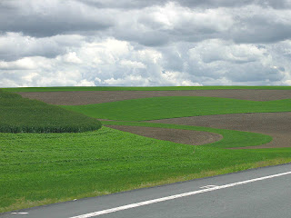
I'm back from my jaunt to Walla Walla. I don't always enjoy the twisty swoopy drive through the Palouse hills, but this trip I truly did. The intensity of the greens from the new shoots against brown earth, the dappling effect of the sun making its way through partly cloudy skies kept my senses thoroughly stimulated. Be sure to click on the pictures for a larger view to get the full effect.


I regretted not having my camera at the ready the last time I drove through this area, so this time it was ready to go on the seat next to me. No time or way to frame my shots - this was true point and shoot photography! Still, it's a wonder I didn't end up in the ditch....ssshhhh, don't tell anyone.

I was hoping to capture that hillside that inspired this sketch, but the lines of the plowed furrows no longer really showed now that the seeds had sprouted. Still, there were some wonderful curves and contrasts to catch.


And bigger than life cloud formation.


At one point I swooped over a hill and spotted this houseboat. I couldn't quite catch it, so looked for it on the way back knowing there was a place where I could pull over to get the shot. I was disappointed that they had moved it closer to the road by then - I guess they worried that people would not see the "For Sale" sign on it. As I first saw it, sitting in the middle of a field, miles from any body of water, it made me think of Noah's Ark, abandoned after the flood waters had receded. Do you suppose Noah put up a "For Sale" sign, too?


This last picture is of bluffs near the Snake River. All along the descent to the river, there was this green the color of lichen, although it wasn't lichen. As I said, the variety of greens I saw was surprising and stimulating. My senses definitely got an injection of possibilities direct from nature.

Sunday, June 08, 2008

More Nature Matching


I'm taking off for a few days, but before I go, I thought I'd share another color pairing from nature. The rich red peonies and bright orange poppies next to my house fairly shout for attention these days. The poor iris haven't got a chance to be noticed except as an afterthought.


I pulled a petal from each and found perfect matches from my stash. My favorite red is a commercial batik (which the camera did not pick up well & no amount of manipulation could make it true, although it is better); the orange that fits well into my default palette of rusts and browns is a sunprint from South Africa. Normally, I would choose a red with more of a red cast than a blue cast to pair with the orange (if I thought to pair them at all), so I was surprised that my reaction was, "Mmm, these could work together."

Saturday, June 07, 2008

Matching Fabrics to Nature-Another Approach


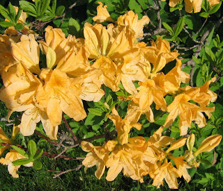
My machine that I do all my free-motion work on went in for servicing yesterday, making me feel at loose ends. As if I don't have plenty I could work on without it, but it is unsettling all the same to have it missing from the studio. So I found myself continuing to play with this idea of the azaleas as palette inspiration. If you are unable to actually bring nature into the studio as I illustrated in the previous post, here is how you can use your photos to pin down your colors. I started with a close-up shot of one bloom (shot at high pixel size) and cropped it so no other colors intruded (photo above).


Then I applied the pixelate effect in my Corel Paint Shop Pro program. I set it for relatively small symmetrical squares which showed just how many different yellows and greens are represented in that flower. Even some browns snuck in. This could easily be printed out to use in the studio when pulling fabrics (or if you're lucky enough to have a computer in your studio, you could match from the screen image.


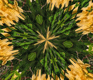
The problem with photo manipulation programs is that there are so many things to try. "As long as I'm here," is what I found myself saying, and ran my photo through quite a few things. Ahem, over 20 different kaleidoscope versions generated by the random button got saved, including the one above.


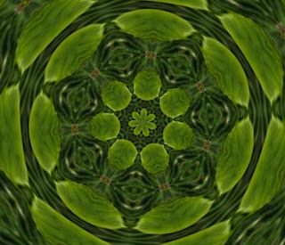
Some of the kaleidoscope variations had no yellow in them at all.


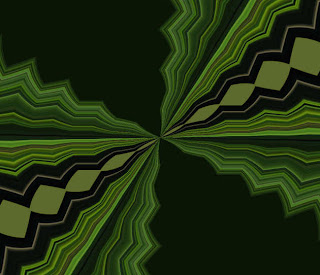
And an amazing number of versions with an art deco feel popped up.


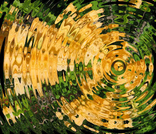
This last one is from the ripple effect.

Bringing Nature Inside


While I spent the week marking and basting sashings for applique, and working through the last few issues on my TIF piece (neither activity generating blog-worthy reports), my mind has been pondering a new color palette. The azaleas bloomed and I found myself intrigued by the juxtaposition of the three colors they represented. At first, it was just the buttery yellow and the classic azalea color (tangerine?) I considered in combination. Then I noticed the purple blooms not fully opened. This is a color scheme I probably would not pull together out of my head. It's a bit tropical in nature, without being loud and splashy.


I easily get stuck in a rut when choosing colors for projects. It is probably fair to say that my default palette is one along the lines of my autumn pieces - rusts, browns, golds, blacks, a touch of rich green. Next favorite often pulls in blues with yellows or reds. Note "or" there - I often have trouble pulling in a third or fourth color unless a let a fabric do it for me, like the batik in Flow. I seem to be thinking a lot in black and white lately, my design ideas more like pencil sketches in my head. I want to try something, then let myself get stuck choosing the "right" fabrics to carry it out. Or bore myself by picking the same combinations. So while this color combination with green for a background may not seem revolutionary to you, it jarred something loose in me. I could see them from my studio window, and found I couldn't concentrate on the project at hand until I'd pulled a few fabrics to mirror those shades.


A few days later, I remembered to grab the camera to record the combination before the flowers faded. It'd be just like me to let the inspiration disappear before I actually acted upon it, then wonder just what it was I thought I was trying to do. I erroneously thought that once images were safely saved, my mind would refocus, but this idea just wouldn't let go. Why wait to print out my pictures to verify fabric selection when I could cut blooms to bring into the studio? That's when the real fun began.


I was amazed at how closely I could match the blooms from my stash. Usually I am missing at least one key color. Hand-dyes and batiks readily spanned the values. But what to make from them? That's an additional problem I've been having lately, being inspired by a set of colors or fabrics with no idea how best to show them off. This time, brain still churning away without my permission, two ideas presented themselves. One is an older idea, an exercise of sorts from a book that never got tried (because I clutched on choosing fabric). The other is a more recent idea captured in my sketchbook and even colored in. It seems to be winning out, and my subconscious is eager for me to get going on it, flipping through ways to execute it, doing all this planning while I work on other things. In fact, I can tell the technical direction it is going is directly influenced by the applique I'm working on right now. It is flowing like Flow did, and making me feel that antsy-ness to get to work that has been more off than on as of late. Tis a good feeling.