Saturday, May 30, 2009

What Is That Thing?


On the way to movie night, I spotted this piece of metal in the dirt by the side of the road. Besides being dirty, it was rusty too, so I didn't want to drop it directly into my bag. I could envision people asking as I looked for something to wrap it in, "What is that in your hand?" and me answering, "Occupational Hazard."

Because, in fact, I have no idea what it is, and it didn't occur to me to wonder what it had fallen off of. I just saw an interesting shape, paused to pick it up and admire it, and just as quickly decided to keep it. It could be traced around. It could be sun printed. It's heavy enough to be a paper weight! And my friends who rust dye are probably drooling over the marks it would leave if wrapped in damp fabric. Spotting and carrying home such bits & pieces to use in my art, you see, is definitely an occupational hazard.

Friday, May 29, 2009

Azalea Series?

It certainly feels like I'm working on a series. Or maybe I'm just determined to use up all the leftovers from the original fused version of Azalea Mosaic. Whatever you call it, I'm having fun. This one will be named "Broken Promises" (about 5 x 7 inches). I'm very tempted just to mat and frame it as is, no stitching or quilting. Just really like the shapes and colors. There's one more yet to come, provided I can settle on an arrangement for the very last of the bits and pieces.

Still pondering whether I need to add stitching to the big piece before layering for quilting (see this post and Rhonda's excellent observation), I stitched out some additional pre-programmed embroidery stitches. After much staring, I'd decided that the meandering vines only needed to be over the green tiles, and that a King Tut green variegated thread I have in abundance should work as well or better than the Oliver Twist thread I used on Azalea Mosaic III.


I narrowed it down to two and stitched them across the small test piece on the left. I could pin this little piece to the quilt top and step back, to sort of see the effect. I decided too much light green was popping off the surface so tried my favorite stitch in a dark green Sulky Rayon. That last bit of stitching finally clarified for me why I'd been so uneasy about putting any of these machine embroidery stitches on the top: They are just too even, the repeats too perfect. They need to vary more, like the individual tiles, like nature itself, and that's just not going to happen with these programmed stitches. Click on the picture to better see what I'm talking about.

That was it, all I needed, enough information gathered, conclusive decision made. I pulled the top off the wall, layered it and safety pin-basted for quilting today. I'm still considering using one of those embroidery stitches for the quilting between the squares, but that can be easily tested on the quilt itself and removed without leaving holes if necessary. In the meantime, discarding the idea of using any of those embroidery stitches resulted in a sudden rush of other ways to add something more appropriate. Whether or not I'll pursue any of them is still up for debate.

Tuesday, May 26, 2009

Drawing Studio - Catching up

No class yesterday because it was a holiday, but since I was home and looking for something to do to justify sitting on the porch in the lovely 70 degree weather, I did some reading and then some drawing. I'd picked up the books my teacher is basing her instruction on and decided it was high time I cracked one of them open. I started with Betty Edwards' second book published in 1986, "Drawing on the Artist Within." This has great quotations in the sidebars, including this gem:

"Seeing is totally different from looking...Art is a specialist's activity in this culture, and is just a symptom of the process of seeing."

Maybe that's why we so often refer to our drive to create as being "bitten by the bug" as if it is some kind of disease? I didn't read long until the bug insisted I put down the book and return to my drawing.


This is the second of the hand drawn on a ground exercises. I still need to go back in with eraser to create highlights and darken around the edges but as for the actual shapes, it is as done as it is going to get. I really struggled with those two fingers curling around the phone. Short and pudgy time after time. Turning the whole thing upside down to work on them was a great help.


Then it was on to my second negative space sketch. Working out the relationships between the lines and the cross-hairs came a bit easier this time. Yes, this takes practice.


And here it is with the negative spaces darkened and all other lines erased. I still have trouble seeing anything but the white space, have to really work at letting the negative dark space pop forward. I scanned ahead in the book to the section on negative space and was relieved to find mention of Artist Mark Wethli's response to the question, "When you want to see a negative space, can you see it right away, the very instant you look at it?" His answer was, "There's always a little time lag before a space pops into focus as a shape. But the lag gets shorter all the time."


Remember my work with creating rubber stamp designs cut from erasers? I really struggled with those designs, partly because I was having difficulty envisioning which parts would be printing and how they would look. I looked at them again yesterday and very shortly I started seeing the negative space for how it defined the design area I'd been so concentrated on. Suddenly the images were popping back and forth, negative becoming positive, positive negative, and I could see how each would work as the stamp. Then I focused on the diamond design that I knew wasn't working but couldn't see how to alter so it would. Bingo! Now I got it and could see what to do to make this one work as a stamp. Proof to me that these drawing exercises are having the desired effect.


But back to my second negative space sketch. I still had the sense that I would see the negative space better if it were not dark. As I mentioned before, I seem to see the opposite of what the majority of people see first. So I decided to test my theory and reverse the light and dark areas of the sketch. As I suspected, now I could easily see the negative spaces. Maybe I'll find something in the book that explains that.

Sunday, May 24, 2009

Back to Auditioning - Part III


While I am finishing up the Azalea Mosaic Test piece, I am still confronted with a dilemma for the full size piece. I'm not convinced that adding the same sort of machine embroidery over the large piece (which I believe is around 24 x 24 inches) will do anything but detract from its strong graphic lines and colors. Yet a little voice keeps asking if it doesn't need more...of something, but I don't know what. I'm not sure which voice to listen to.

Sometimes dragging one's feet on these matters is a good thing. One may think it best to move along, jump in, admit it's unfounded fear holding one back from taking the next step, but sometimes it's time well spent. The subconscious works away at the problem and presents ways to approach it when you least expect it. My biggest problem here is that I need to see the effect full sized. In the last couple of days I've finally thought of ways to do that without committing thread to actual art. Above is one solution; I had a printout I was using to guide my placement of fabric squares. No reason I couldn't take colored pen to that to mimic the stitching I had in mind. It may not be full size, but it's giving me more clarity than my test piece or what's been floating around in my head.

Another thing I'm considering is using a clear overlay that can be drawn on. Tablecloth vinyl would be perfect for this, or cobbling together some transparencies to cover the entire top would be another solution.

Other thoughts that have come to mind: Just go ahead and quilt it and see what I think. Then if I feel the need to add vines, I could do it some other way. Believe it or not, I actually considered painting them on (that drawing class must be to blame for this unexpected confidence that I could successfully wield a paintbrush thus). Or perhaps they could be drawn on with a fabric marker. Hand embroidery is another possibility.

But doesn't this quilt understand that I just want to be DONE with it??? Apparently not. Definitely open to suggestions here.

Saturday, May 23, 2009

Back to Auditioning - Part II

I finished up my Azalea Mosaic test piece by satin stitching around the edge with the same Oliver Twist green thread I'd used for the vine/leaf machine embroidery. 100% happy with how that looks! I assumed that a black background would suit it best, but of course, wondered about purple as well. Perhaps that would help the purple squares stand up more to that intense yellow. Again, I've cropped these auditions in Paintshop Pro and added a black border to represent the metal frame I plan to mount it in.


I was surprised that I didn't like it better. Although any of these more or less work, none give the impact I was looking for. A little strong, a little busy, a little dull...close but just not right.


So surely the black will be the no brainer, really set it off nicely. This is the same black as auditioned with jungle. It's a batik with hints of purple and blue in it. Huh. It seemed to sap all the life out of this little piece. Didn't expect that.


But the green...oh, I kept coming back to this green and every time it made me smile with pleasure. The satin stitching even pops off it instead of becoming lost on it. I think I have a winner here. Finished size will be 18 by 11 inches. Click on any picture for a larger view.

Back to Auditioning

I often get impatient with the creative process. At a certain point, I want to be done with the decision making, the influx of clever ideas, the laboring over final details. In short, I want to be done and dusted and moving on. But my pieces often don't agree with me. Case in point: Jungle. I'd already spent a lot of time pulling all kinds of possibilities to mount it on (see this post), narrowed it down to one, solved a new problem that cropped up demanding more auditioning and mulling, and was only waiting for a break in higher priority projects to quickly finish it up.


Wednesday, I squared it up and sewed on a narrow binding to create a little spark and delineation between it and the dark background I'd chosen. I placed it on that background and sighed...not at all sure that it was showing it off at all. Worse yet, I had this nagging feeling that it required some beads added to help jazz it up. It just looked a little boring and faded to me. Maybe the binding was a little too much pop? So much for finishing this up quickly. I'd already started pulling some fabric to audition for another piece, so started trying it out on some of those.


Greens looked awful. Purples looked awful. I even tried various tropical oranges and blues. Nothing made me pause and wonder for a second. Then I wondered if the burgundy crushed velvet I'd used on Twisted Tree might be just what I needed - rich and mysterious like the jungle itself. Uhhh, nope (the photo makes it look like it works better than it actually does). I was ready to resign myself to the black as the only answer.


This one was absolutely an afterthought. It was draped over the back of the chair next to the design wall. It was there only because I'd washed it a few weeks ago and hadn't gotten around to putting it away yet. It intrigues me the most, the way the bits of orange seem to balance the orange in the binding. It may be the solution to my dilemma. What do you think?

By the way, I used my Paintshop Pro software program to crop my photos so that you see approximately the amount of fabric that will extend beyond the binding, then added a border to represent the black metal frame I'll be mounting the finished piece into. I think it is critical to seeing which fabric will work best. It will finish at 13 x 11 inches. Click on any picture for a better view of the subtleties of each fabric

Wednesday, May 20, 2009

Playful Diversions

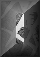
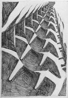
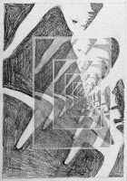
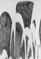
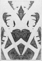
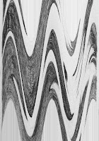
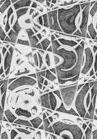
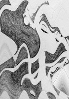
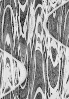
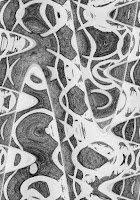
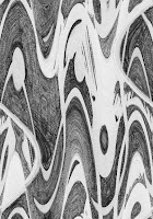
I got sidetracked yesterday as I was preparing my negative space drawing for posting here. As I thought more about how negative space can be an interesting design on its own, I wondered how this drawing might react to some of the effects in my Corel Paintshop Pro software. How different would my results be with this basic black and white drawing from the color photos I've played with in the past here, here and here? I started with the final rotation of the drawing seen above.


This is buttonized, an effect I hadn't tried yet. This got me thinking about that technique of using a "view finder" to move around a picture until you find an interesting section. Also, I can start to see what would happen if I played with fracturing or overlaying a separate geometric design and changing values within the different spaces.


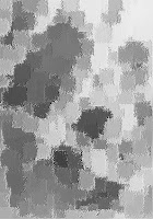
I noticed there was a brushstrokes effect. Ok, so how would a pencil drawing look with brushstrokes? One of the random settings produced this, which I then could not resist colorizing in one of my favorite palettes. This is the sort of thing I've been thinking about trying with actual paint and brush, so must give it a go.


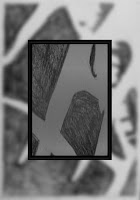
Magnifying lens is another effect I hadn't tried. I like this idea of making a small portion larger and superimposing it on the actual design. I've done the opposite of this - taking a detail and superimposing it smaller which is also effective.


I had no idea what the feedback effect would do - it was perhaps the most surprising.


Here's another feedback at a different setting. I really like these.


And how cool is this polar coordinates one?


The rotating mirror reflection effect reminded me about playing with my actual set of mirrors. Do you see primitive faces and figures in these?


And finally, my all-time favorite...the wave effect. I just keep clicking the random button and seeing things I love. This and the kaleidoscope effect quickly showed how differently I responded when no color was involved. More waves below.


Tuesday, May 19, 2009

Drawing Studio Session 4 - Negative Space

Another Monday, another drawing session - this time with a bit of drama. Our teacher got stuck in construction traffic making her over an hour late. So we muddled forward with phoned-in instructions we didn't clearly understand and didn't truly catch what we were supposed to be doing and why until she finally arrived. It was more focus on negative space, this time eliminating all detail in the object we were drawing. Can you guess what my still life was composed of?


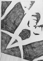
Once the basic outline of the still life was sketched in, and then the space around it darkened in, we were encouraged to view those spaces as interesting shapes in and of themselves. The teacher picked up mine and turned it this way and that, really liking those spaces. So you won't have to twist your head, I've rotated my drawing for you.


Have you guessed yet what it is? The composition placed in front of me was overlapping antlers with a feather threaded through the prongs.


We used the picture plane again to trace the outline before drawing on paper. This was more difficult since the plane could not be rested on the object we were tracing. In the first drawing, we simply drew the same size as the picture plane, but on the second one, we went back to drawing at a larger scale. You can see the cross hairs on my second assignment (kitchen utensils "interestingly" arranged) which create a grid like is on the picture plane to facilitate in that enlarging. I still find this very hard, so the teacher suggested I do a quick sketch to get the general shapes in position, then go back and fine-tune to a more accurate rendition. That suggestion helped a lot. As you can see, I didn't get much beyond that sketching out, so have some "homework" to do this week.


Intellectually, I know what negative space is. Yet every time I run across that term as a design tool, I haven't really gotten what it means, why it is as important as positive space, nor how I can use it for design ideas. The teacher admitted that this exercise was very simple, but because of its simplicity, it would help our brains get used to seeing the negative space on its own. I do sense that I am starting to get it, to move out of the intellectual realm as I experience "making" negative space. Something tells me that I would see it more clearly if the negative space were left white and the positive space darkened. I've noticed that my eye often see the reverse of what most people first see in images that can be viewed two ways. For instance, when looking at pictures of old quilts, the quilted motifs often look sunken instead of raised up as they truly are. I seem to see receding images. and really have to work at making the image pop the other direction. Maybe that's why I struggle with this negative image stuff. How do you see?

Sunday, May 17, 2009

Test Run


I've had so many distractions and diversion in the last week or so that I couldn't get much done toward my art. But yesterday I spent a big chunk of time at the sewing machine and it was wonderful to be working again. Of the several things I could have worked on, I chose to proceed with my sample to try out ideas for finishing up the Azalea Mosaic. I was curious about the effect of adding meandering vines across the quilt, as if looking at a mosaic tile pathway in a garden. I didn't want it as quilting, I figured, because I wanted it to look like it was growing naturally up and over the tiles, not flattening them down. So I fused some leftover squares to extra background fabric and stitched away.


But first, I tested some of my machine's pre-programmed embroidery stitches on a scrap of fabric. You can get an idea of what a stitch will look like from the manual and the screen on the machine, but I can't really tell exactly what it will look like until I've stitched it out. The first tests were done in an old cotton thread I care nothing about, ditto for the fabric & no stabilizer. Since the squares are fused giving some stability, I wanted to see how badly the fabric might pull up without stabilizer - for the areas between the fused squares. The final test (far left) was done with the actual thread I planned to use - an Oliver Twist Hand-dyed cotton. I settled on the pattern on the far right, but wanted it to look a bit more free flowing, so on the left you can see where I tested increasing the stitch length. You can also see that I penned the identifying stitch number above each stitch, and then noted the length changes. I'll keep this sample for future reference.


How often have I auditioned threads, thinking I've come up with the perfect one, only for it to disappoint me on the real thing? Often, and in this case, I'm thinking this may have been more effective with a green somewhere in value between this one and the dark green I used for the actual quilting. Of course, that's a color I do not have on hand. But I do love the overall effect. There was a bit of distortion because of not using a stabilizer, but I was able to press it out. Not sure I could do that properly on the larger piece. And I have no desire to remove stabilizer from this type of embroidery - so time consuming and you never get it all out. Wouldn't want to use water soluble stabilizer, but perhaps one that disappears with heat would be the answer.


Click on the picture above and you should be able to see that darker green thread (a Sulky rayon)and the quilting. I used a slightly wavy pre-programmed stitch with width reduced and my walking foot to quilt between the fused squares. I was afraid that since the quilting was done after the embroidering, it would show in an unwanted way where it crossed over the lighter green thread, but to my surprise, it did not. Very pleased about that. And the vines do give the organic look of rising and falling as they move across the tiles.

While I like this effect on this small version, I don't think I would like it all over the larger quilt even if I had a suitable darker thread. And of course, I doubt I have enough of this thread to cover the larger quilt - story of my creative life. Maybe I can think of a different way to add a little garden feel to it, but I don't think this is it. I can also see that this quilting stitch doesn't quite make the squares pop like I wanted, even with the Matilda wool batting. But I am pleased enough with these results that I plan to finish this up and mount it much in the same way that I did Twisted Tree. Nothing ventured, nothing gained - this was a definite gain.

Saturday, May 16, 2009

Browne's Addition Tour - Bricks & Gingerbread

One last look at the architecture in Historic Browne's Addition, this time strictly from a design perspective that might cross over into my own art, and yours too. As always, click on any picture for a larger view.

Under my feet - cobblestone streets peaking through, brick paths in different configurations.


And when my eyes looked up, brickwork and details only necessary to please the eye.


Slightly skewed and sagging carriage house doors, well worn.


These steps to nowhere...this is behind & below the museum, but once must have led to a fine house. Or perhaps a shortcut between houses for impatient children, or the beginnings of a path into a wooded retreat.


Speaking of fine old houses, so many of them exhibit "gingerbread" trim. Note the similarity between the sunburst's rays over the porch and the swirls in the trim below. This was a bit unexpected that seemed to say of the designer, I don't have to do this like everyone else.


And last but not least, a bit of nature's "architecture." I was so intent on capturing details of one of the houses, that I nearly missed the fact that I was standing right next to this highly textured tree. It was quite large (the fence you just see in the pic is about 4 or 5 ft tall) and the bark texture equally large, unlike the finer texturing I'm used to seeing. Deep grooves, shadows and light, lines intersecting at all angles. It begs to be drawn.