Tuesday, September 30, 2014

Good News, Everyone!

"Energy" has a new home
Well, you have to be a Futurama fan to get that reference, but if you are, you understand that the news is more good for me than it is for everyone. Still - I hope you will be as excited as I am. ArtWalk wrapped up back on September 12th with the sale of two more quilts! I'd started seeing my nurse practitioner on a weekly basis for allergy shots, and she quickly made the connection between me, her patient, and me, the artist she'd seen over at Monarch Mountain Coffee. Her practice is expanding, she's redecorating her offices and buying a few new pieces of art to support the local art community. And she wanted to include me in her purchases. I had this sneaking suspicion that she'd want "Tears of Mayo" which I had not offered for sale, and she admitted that she did. Frankly, I couldn't think of a better person for it to go to or a better place for it to be, so we agreed on a price. She surprised me by buying "Energy" as well.


But wait - there's more good news! The manager of the coffee shop had mentioned she might like my work to stay up after ArtWalk, depending on whether any other appropriate artists were lobbying for the space. She confirmed last week that I could continue showing there and was delighted to hear that I could switch out some of the ArtWalk pieces with fall-themed art. I was so glad my work table was still cleaned off so I had a space to set out various pieces for consideration and fill out gallery cards and other paperwork.


And I indeed have many pieces with fall colors or themes, many pieces with leaves, pieces I've shown in various exhibits around town but which probably haven't been seen by most who frequent Monarch Mountain Coffee. It's good to get the older work out of the closet, assessed with a less critical eye than when it was first finished. Down came the newest work from the long wall in the back, up went quilts with trees and leaves. Impossible to get a decent picture so here are links to the individual quilts: Fracture, Falling Leaves, Wisconsin Memories, Far From the Midwest Prairie.


Different work also went up along the wall up front: Azalea Mosaic V: Slippery Slope and Jockeying in the Queue.


"Idaho Maple" took the place of the two Upward Ticks. This guy was sitting in the same spot the day I hung the original exhibit - I think this is his daily spot - and was very gracious about nudging over a bit to give me room to work.


I decided to leave the Upward Ticks there, just move them to a different spot. This idea of moving existing artwork around was the manager's suggestion and a good one. Because of the layout, and the way regular customers often sit at the same table each visit, just moving something to a new location could bring it a new audience. Plus I think these two look quite different over the quasi-fireplace thing with a wall of a different color and different lighting. Note the coffee shop has been decorated for Halloween.

Northwoods Autumn Splendor - Sheila Mahanke Barnes ©2001

While I was digging through my stock of quilts, I ran across this one made in 2001 while living in Wisconsin, briefly considered it for the coffee shop, then decided against it. But I do have this good-size wall in my office where nothing was hanging at the moment. I haven't had "Northwoods Autumn Splendor" out in ages so up it went at home.


My friend Judi brought that leaf fabric back from a quilt show she had vended at and presented it to me - you all must know why. Not at all her style but definitely mine! At the time, I was working with these pyramid blocks of diamonds in another project while always considering how I could work our hand-dyed fabrics into traditional quilt designs. Beyond the piecing, a technical challenge I worked on was how to get parts of the border leaves to extend past the seamline into the body of the quilt. The abstract image of trees in full color is reinforced by the individual leaves fussycut from the border fabric and scattered across the center of the top (they are fused in place). I wasn't terribly comfortable with free-motion quilting yet at this stage - otherwise I might have quilted in a few leaves as well. It's just such a rich quilt colorwise, just like the northwoods of Wisconsin come fall. Leftovers of the leaf fabric went into "Wisconsin Memories" and the last bit of it into Autumn Confetti. Good to the last drop!

--------------------------------------------------------

Just a reminder to hop on over to Hilary's blog to read her Around the World Blog Hop post here. Also, you might enjoy reading my friend Sherrie's post on the subject and checking out her links. I wanted her to be one of my tagee's but someone beat me to it. And yes, she was getting ready to tag me as well!

Sunday, September 28, 2014

Required Reading

Regularly updated, look for the most recent edition
As a general rule, I am not an alarmist. I've been known to roll my eyes at the latest Robbie the Robot "Warning! Warning!" alert. I tire of the sidebars in magazine articles about safety practices for techniques that in my estimation are NOT that dangerous, viewing them as the proverbial CYA of our litigious society. However, when I saw this book show up in an Artist Daily e-newsletter, the brief description led me to believe I really should take a look at it, if only for the chapter on fiberarts. Probably all libraries have a copy of it, as mine did, so no excuses - find a copy and read the introduction if nothing else - just not at bedtime. This is nightmare inducing stuff.

Hazardous materials lurking in my cupboard

I know what you're thinking - I just work with fabric and thread, nothing hazardous there. Well, a lot of these hazards depend on how much exposure you have to them, how many hours a day or days a week you work around them. You probably don't have to worry about lung problems from breathing in loose fibers like dedicated spinners do. But if you doubt you breath in fibers at all, just look at what builds up in your sewing machine from cotton thread and fabric. And I've recently found out from another source that cotton fabric naturally harbors several types of mold which may trigger allergies and asthma in some people. But beyond that, are you using any spray adhesives like 505 Spray Baste? Protecting your finished art quilts with UV or stain repellant products? Do you do as the instructions say and use these in a well ventilated area - probably outside as the common household does not have the sort of vent fan strong enough to remove the toxic nature of some of these products? I've gotten pretty lax about that, having set up a place in a spare bathroom to do my spraying when the weather doesn't cooperate. After reading the section relevant to this issue, I checked to see if anything I was using contained any of the very hazardous ingredients, and sure enough, many did. I've been risking my health with my shortcut methods of "safe" use. Luckily, I don't use these regularly, but when I do, I should be more careful - some effects are reversible, others build over time and are not. When there is a choice, one should pick a non-aerosol which reduces what might get suspended in the air to be breathed in.

Shiva Paintstix & solvents

But there's more to consider. Many of us have started playing with surface design methods, dabbling with paints and screen printing, dyeing and discharge, sketching and using markers and embellishing with unusual materials - areas most of us have little or no training in. Now, I've always been very good about masking up and using gloves when I mix dye powder into solution. Again, if you ever doubt that those powders could travel far, far enough to get up your nose, just put a damp paper towel or piece of fabric on your work surface and see what happens as you spoon your powder into your container. I was truly amazed the first time I did this - those particles really travel. But I've never worried much about fumes from bleach, paint thinners, adhesive sprays fixatives or glues but I should. Do you use Shiva Paintstix? They are oil based you know - smell so that I double bag mine when not in use. Brushes don't clean up with soap and water, like the more forgiving  acrylic paints which are relatively safe, but need a solvent like turpentine. Ooo - a big no no, apparently. Fortunately, when I went shopping, Turpenoid was what was on the shelf. It is odorless and relatively safe to use. Ditto with the acetone I bought to thin my favorite glue. But still, these need to be used carefully. And really, I should probably use gloves more than I do, as some of these hazardous materials can get into your body through the skin. I've also noted a trend among some art quilters to use house paint to achieve the effects they desire. I was quite surprised to find it too has its hazards.

So now I'm a little more aware of my materials, what to look for and how to safely use them. I hope you will read up on this so you will be safe too. 

Friday, September 26, 2014

Urban Sketching

Panhandle State Bank taken from Monarch Mountain Coffee sidewalk seating
September seems a difficult month for my art group. With only four of us, we can be flexible and move the date around if a conflict comes up for one of the group. But September often finds one member out of town and scheduling problems for the others. Thus, even though we had moved the date once, a second member had to bow out at the last minute. Meg and I decided the least we could do was meet for coffee, enjoying the outdoor seating on an unseasonably warm day. We sat across from the Panhandle State Bank building, this view which I had identified just the week before as one I wanted to sketch from just this spot before the weather turned cold.


One of the challenges of sketching on location is training the eye to frame the subject matter. When using a camera, the frame is right there and you can move it around, zoom in and out, until you have the perfect shot. Without the camera, the eye takes it all in and sometimes doesn't know where to stop. So I studied the building for a bit before starting. This is what I thought I wanted to include.


This is what I sketched. Another challenge is scaling what you want to include to the size of the drawing surface. And as you can see, I was way off. I have yet to figure out the blocking-in thing, definitely didn't sketch in enough loosely before taking off on details. I essentially worked from the top down and so the size of those first windows determined how much else was going to fit. Still, there were plenty of angles and light play to keep me busy for an hour.


Today I did some touch-up, darkening lines and adding more shading and some color with Prismacolor pencils, still struggling with this tan toned paper and graphite pencil. I either need to use a larger sketchbook or learn to draw smaller!  Wouldn't hurt to look at a book or two on the subject either because, of course, they are available as this urban sketching thing is all the rage right now.

Or...there are always on-line classes. I found out about one called Storytelling being offered by Sketchbook Skool (starts October 3rd) through this blog post by one of my favorites, Mattias Inks. It sounds exactly what I could use and features 3 other instructors besides Mattias. Each style is different so I think it would be great fun and very worthwhile. Unfortunately, time and money are in short supply at the moment, so I will just keep plugging along, learning as I do.

Thursday, September 25, 2014

Another One Down...

I finished up the quilt for my niece-in-law's baby this morning so it is winging its way to California, hopefully to arrive before the baby makes her big entrance. Apparently she has been getting restless, with designs to make an early appearance, something mom would not mind at this point. I'm glad to have this done and out of the studio - it is so unlike anything I would have come up with, but exactly what mom wanted to have made. As I quilted the diagonal lines across those gray crosses, I was reminded that this is why I rarely do commission work. Too often it means working with colors and fabrics and even designs I'm not that crazy about. It's better when the client gives me carte blanche on those things, but then I worry anyway and find myself trying to second guess what they would like. The best is to have someone choose to buy a finished product - I have made what I wanted to make and they know exactly what they are getting.


The quilt ended up to be about 49" x 66" after I spritzed it with water and tossed it in the dryer. I needed that pulling up of the cotton batting to hide some of the wobbly lines of the grid. It's amazing how difficult it is to sew a straight line across a quilt, even when marked )I used a hera marker so there'd be no guidelines to remove), and all the more noticeable when done in contrasting thread. As much as I thought teal would look good and found agreement with the nil, once I started adding it, I wondered if I should have stuck with white. Too late now! This is Superior Fantastico polyester thread. Oh, it is yummy stuff and worked well in both the top and bobbin.


As with the other baby quilt for the godson's baby boy, I opted out of making and sewing on a separate label. Instead, I just carefully inked a brief inscription on the back using a micron pigma pen. Ok, little Emmy, you can come out now!

Monday, September 22, 2014

Around the World Blog Hop

Details - Autumn Confetti by Sheila Mahanke Barnes ©2008 Private Collection
Hello from beautiful northern Idaho, where the leaves are starting to turn! I've been asked by Chris over at Chris's Quilting Universe to participate in the Around the World Blog Hop. I'd seen a few of these posts on some of the blogs I follow but really hadn't figured out what was going on until Chris contacted me. It's another one of those "tag" things that starts with you sharing things about yourself and then tagging others to do the same. This time, though, it's not just quilters being targeted but any blog that shares some kind of creativity, and what you share about yourself is directly related to that. I've addressed some of these questions before in my blog, but it never hurts to revisit them.

What am I working on?
This has been an odd year for me as I decided to take a break from focusing my priorities on completing textile art for the next local exhibit deadline. As an artist member of Pend Oreille Arts Council, I've had plenty of opportunity to get my art into the public eye, and that has been good for me. But that also kept me from pursuing what I think of as side projects and thus low in priority. This year I decided would be a year for exploration and working on whatever was calling at the moment. And so, in addition to completing new work for the annual ArtWalk, I've also spent time dabbling in art journaling, continuing experiments with linocut printing from a class I took last year, started sketching again with local architecture as my subject as well as returning to Zentangling, printed out new photo manipulations to test on padfolios, tried my hand at fabric-wrapped coiled baskets, made myself a soft-cover journal. You can see I have a lot of interests, and on the surface, some of it may look unrelated to my core work with art quilts. But besides providing a break, all these things have something to teach me that can make my original designs for my textile art better.

Next project surrounded by potentially paired fabrics awaiting further inspiration.

But I feel myself itching to get back to work with some of the ideas that have lingered on my design wall all year. I think this is the next one up - pairings of a couple of pieces I shiboried last year with a rediscovered African batik and a friend's hand-dyed fabrics (see above). Late last year I had an urge to start a water series with a specific piece in mind to start it off, even gathered water-related textiles on the wall (see below). Instead, I seem to have gone into the series sideways with heed-the-call designs I didn't think about being water related until later rather than insist on a predetermined order of specific ideas. That shibori says water to me and is broadening the scope of what my series thought it was going to be.

Water inspiration wall.

How does my work differ from others of its genre?
That's a tough one. I'm still struggling to think I have a distinctive voice, although many tell me they can recognize my work right off. There are a lot of us art quilters working with nature themes or inspired by nature as I am, a lot of us working from photographs, embellishing with specialty threads and beads, using our own hand-dyed, surface-altered fabric. So I will go with this. My work almost always exhibits a precision and attention to detail, a neatness and symmetry that many works of textile art do not. That's not to say my work is better because of it or that I'm looking over my shoulder for the quilt police, just that this is my personal choice and aesthetic. I can't tell you how many times I've been told to loosen up, quit fussing! But I have to say, loosening  up in the way I work usually leaves me uncomfortable, tense and unhappy with the outcome. There are many art quilter's work that I do like that exhibit this freer style, but for the most part, it just doesn't work for me, so please, let me get back to my uptight way of working! ;-)

Emily Carr Skies ©2009 - masochistically pieced, not appliqued, then framed.

Why do I write/create what I do?
I've had a life-long love affair with fabric and working with my hands. I've tried most of the needlecrafts at one time or another, loving the calming effect of repetitive stitching (whether it be embroidery, cross-stitch, knitting or quilting) and the thrill of watching pattern slowly emerge from a single strand of thread or yarn. I was in junior high or high school when the resurgence in hand crafts of all kinds hit, and combined with my interest in a quilt made my a grandmother who died before I was born, I dived into patchwork via patterns in magazines for things like tablecloths and pillows. I even made a now cringe-inducing prairie dress whose skirt was squares cut from dressmaking scraps. Years later I made my first quilt, again from a magazine pattern, and then another and another, eventually finding myself making small deviations from the printed patterns I followed. Eventually it dawned on me that making quilts, unlike the other needlecraft I indulged in, was something I could put my own stamp on, change up, be creative with. There was no going back after that.

Initially, my quilts were very traditional, or at best, contemporary. But as time went on, I noticed some artsy fartsy elements creeping in. Honestly, I'd be tweaking a design, playing with border ideas, and suddenly wonder, where did THAT come from. I became torn between the reproduction antique quilts I was making and this other thing that was more of a design challenge for me and could incorporate the hand-dyed fabrics and batiks coming on the market. I guess I was evolving and in 2006, I gave in to concentrate on creating art quilts. My brain rarely goes on vacation, flashing ideas across my consciousness like a slideshow I seem to have little control over. Fabric is what I feel comfortable with to see if I can transform those ideas and images into something I can share with others. I think I do this because I love working with textiles, solving the technical and design challenges, and sharing it all with others.

2008 - My first POAC exhibit - I've come a loooong way!

How does my writing/creating process work?
It varies. I take a lot of reference photos and sometimes that's where I start as in Shadow Grass. Sometimes I'm just struck by a color combination in nature and pull fabrics to match while thinking of a design to use it in. Ditto with an unexpected juxtaposition of fabrics as I sort through my stash. It may be my traditional quilting background, but even leftovers from the current project lying on the worktable can trigger an idea for the next quilt or an entire series. Sometimes it's those flashes that seem to come out of nowhere that I pursue and sometimes rough-sketch in a sketchbook. But a lot of the time it's something I see in a fabric that I then try to tease out so that others can see it too. It's always some kind of challenge that keeps me interested.

And then, depending on the situation, I may enlarge a photo or sketch and trace templates or onto fusible web, or freehand draw to scale a pattern, then search for fabric. Or I may just design on the design wall, putting up pieces of fabric, building bit by bit, sometimes with more of a plan than at other times, letting the quilt tell me what it needs next. I talk a bit about this here. All the while, a part of my brain is pondering how this will be quilted, if it needs beads, how will the edges be finished, will it be framed or mounted. Each piece calls for its own resolution, as this blog post shows. Even what kind of batting, or even if I'll use a batting, is different for each completed top. It's the rare quilt that I've made all those decisions about before I begin to construct it.
 
Upward Tick quilt in progress - auditioning auditioning auditioning everything from backgrounds to color to size to placement


*   *   *   *   *


If you are new to my blog (and even if you're not) and game to read more, I've added an artist biography which tells more about my background and an artist statement which might clarify some of the above ramblings (see tabs under header).
Wait! You're not done reading yet!!! Now that you know more about me, be sure to hop back to Chris's blog and read her Blog Hop post and maybe follow some of her blogger links. Then hop over to the bloggers I have tagged. I'll be honest, I had trouble getting the suggested number - this is a busy time for many - and being kind of busy myself, I wasn't as diligent as I might have been in seeking out participants as the regrets came in. 

However, I did get an enthusiastic "yes" from Hilary Grayson of Living to Work - Working to Live. Hilary's blog shares a fun mix of textile explorations including quilting, book-making, surface design and mix-media with lots of play with paints and inks. I love that she occasionally posts links to instruction videos in some of the techniques I'm interested in but haven't the time to track down on my own. And this all gets a slightly different spin for me since she is writing from the UK. Don't forget to return to her blog next Monday, September 29, when she'll be posting her answers to the Blog Hop.

I'm also going to send you over to another UK blogger who turned me down right now but really hopes she has time soon to answer these questions in an unofficial Blog Hop post. Margaret Cooter's self-named blog has changed dramatically since I started following her years ago. She still posts the occasional quilt and textile-related items, but as her interests have expanded, so have the subjects that she posts about - drawing, painting, bookmaking, trips to art museums and exhibits, artists she likes, poetry. It all informs her personal art. And again, the perspective is slightly different because of where she lives, and I love the many photos she shares of things she spots as she travels around London and on vacations to other countries. Lots of inspiration there! 


Friday, September 19, 2014

Quick Quilting

I've spent the last two afternoons piecing together the red cross block variation quilt top requested by my niece-in-law for her soon-to-arrive little girl Emmy. Robin from my art group looked at the picture I'd been sent and said, "you can make this in an afternoon." Well, maybe SHE could, but she was mostly right. With the large pieces and no seams to match, it went quickly. Here you can see I am chain sewing as much as I can, having pinned my layout print next to the machine for reference. With only two colors and two shapes, it would be easy to get confused about the order when not completing one row completely at a time.


No need to draw arrows on my diagram to tell me which way to press my seams. As Eleanor Burns would say, "turn to the dark side", i.e. press seams toward the darker fabric. This avoids the possibility of shadowing through the lighter fabric. This may seem obvious to you, but I always get confused at first figuring out which way to place my sewn unit so that the seam does go to the dark side, can't visualize it. But it is really very simple. Whichever fabric you are pressing towards is the fabric that goes face up on the ironing board.


So here we are at the end of the first day's session, all rows complete and laid out in order. I have to say I'm finding that grey a very pretty one, almost silver. It's just a solid, and grey at that, and I didn't anticipate that I'd enjoy sewing with it as much as I do fabrics with "real" color. The next afternoon's session went quickly too. Even though there was no matching of seams, I still pinned along the length. The longer the seam, the greater the chance that one side will move under the presser foot at a different pace, leaving you with extra at the end of a seam that started out even. But the pins didn't need to be spaced closely and I could run the machine faster than I normally do - speed seaming! Seams were pressed towards the side with the most grey. And then it was time to think about quilting thread.


I laid a few ideas across the quilt top with the backing/binding fabric nearby. White would be the safest choice but the grey which matched the fabric might also work. But I really really want to add some color over the top. I want to do that. So I looked for a teal like is in the backing and found the Trilobal from my Superior Threads sampling order. Oh yeah - if it were MY quilt, that's what I would do. That bright orange on the left was also a possibility but would make a really bold statement. Time to check with the niece-in-law because, after all, she has been involved in the designing and fabric choice of this quilt from day one. I need to know what she wants to do. I couldn't be more delighted that she chose the teal! Time for one last good press, piecing of the backing and layering. Then the quilting can begin!

Tuesday, September 16, 2014

Red Cross Blocks

Cutting begins on the next baby quilt and the nephew's birthday block
More September deadlines looming - time for another birthday block for my late husband's nephew. He turns 18 this week, starting his senior year, applying to colleges with an eye toward pursuing a nursing career. He's been taking a few Emergency Medical Technician courses so I was looking for a way to feature that. My addled brain could only think of images like stethoscopes that I could fuse on a background, but that seemed like a cop-out. I always feel like I should do some piecing on his block, so I turned to my Electric Quilt Block Base program for help. It's the computerized version of Barbara Brackman's Encyclopedia of Pieced Patterns - a book that I own but is not as easy to search through as it doesn't subdivide into keyword search categories such as occupations to find the perfect themed block. Neither does the book offer patterns. In Block Base you can set the block size and print templates or rotary cutting instructions. I don't use it much anymore, but when I do, it is such a wonderful tool. In this case, my search on nurses popped up many variations on the red cross block. Ironic, don't you think, as this is the same block my niece-in-law wants in the quilt for her baby? Can't believe I had the answer to my nephew's block right in front of me and never made the connection.


This particular variation really appealed to me with that added detail in blue - the very school colors as the college he hopes to attend. I always hesitate when using the cutting guide that Block Base generates, sometimes double-checking dimensions, but I have yet to have it be off. It won't tell you sequence of sewing but I'm experienced enough that it's not a problem to break it down on my own. If you look closely, you can see I've penciled in some arrows on the colored printout of the block. That's a trick I learned from a book called "Press For Success" - mapping out ahead of time which direction to press seams for the least bulk. Not every seam can go the direction you want, sometimes you have to make compromises when there's more than one intersection along a seam, but it sure speeds up the process at the ironing board when you have something to refer to. This block went together well and I had so much fun getting back into some traditional piecing.

The Red Cross Block

Neither one of us quite believes that I've been making him a block for every birthday for this long. I think I meant to go to 20, but I am ready to have the blocks returned to be made into a quilt. This actually works out perfectly; if I get my act together, I can have it ready for a graduation gift, having added a block to celebrate that milestone and one last one as a label of sorts. I've kept pictures and swatches from each block to refer to each year (you can see the folder open in the top picture) in an effort to keep the blocks somewhat harmonious, no one block awkwardly sticking out from the others, but I can't be sure. I may have created a monster that will be a pain to make work, or I may have created a lovely memory of one man's life that will go together with ease. I'm really  hoping for the latter.

Tuesday, September 09, 2014

Occupational Hazard - Leftovers

Ok, I lied. There was one more side project to tend to before starting the next baby quilt. I had a few leftover strips from the last fabric coil basket lying on the work table and it would definitely be a good thing to use them up so I can clear just a bit more of the worktable. Besides, I needed a quick gift.


As near as I can tell, this variation on the baskets does not show up in either of my books on the subject and I can't imagine why not. Essentially, it is a plate with a bit of a lip on it - the first few rounds of transition one makes when starting up the sides of a full-fledged basket. It's a handy place to toss keys, empty out one's pockets, a catch-all for miscellany. It's quick to make and perfect for using up the inevitable extra clothesline and strips. I just love the one I made for myself from the leftovers of my first basket.


It's about 6" wide across the bottom and rises up about an inch or so. It should look good sitting next to its cousin. 

Monday, September 08, 2014

Side Project

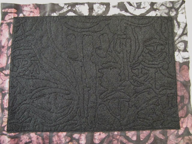
I need to get going on the next baby quilt but I wanted to sneak in another small project before I start cutting and piecing. I wanted to try my hand at making a journal similar to the one I received from Michele in our exchange, having filled all the pages in it and needing another place to continue my musings and meditations. I'd been wondering what I could do with this small bit of African batik from my late-friend's stash, a piece I truly love but which has a waxy feel that will not wash or iron out. But that very thing could be an asset in a journal cover, and this piece was the perfect size. Michele uses felt as her base and I didn't have anything on hand big enough so got this Kunin felt at JoAnn Fabric, enough to possibly use as "batting" in small art quilt projects (or maybe just more journal covers). I didn't anticipate how much I would fuss with this over several days - it was supposed to whip up in a flash! I should know better...


Here's the whole piece of batik after quilting - you can see why this would be difficult to incorporate into a bigger project but works in something like this. I started by cutting the felt to finished size, trusting that there wouldn't be any shrinkage with the quilting, then spray-basted one side, centered it on my batik, and ran a line of stitching along the edge so I'd know where to stop the quilting. I auditioned several off-white threads, but they all seemed too showy. A brown rayon was more to my liking, but maybe erring too far the other direction. What - you can't see the quilting?


No, you can't, not unless you look closely, but you can feel the texture when holding it and I decided that was good enough.


Simple simple free-motion quilting around the batik designs, the type that creates minimal stress for me.


So here is the "inside" of the cover. You can see that this piece of fabric was just the right size, and rather than trim it to size and satin stitch the edge as Michele did, I couldn't resist that clean finish turning it to the inside would create.

Left side with fusible, ready to turn. Right side turned and fused.

Here you see I'm working with the sides, trimming the corners after applying strips of fusible on the fabric, then smoothing it over the felt for fusing. I'm trying to use up Pellon's version of Steam-a-Seam that I bought to try out while impatiently waiting for the real thing to be back in production. On first blush, it seemed to be pretty much the same, save for the plastic it is extruded on. But now having worked with it a bit more, I am finding it a real pain to use and won't be buying more. It's part of the fussiness that slowed me down on this project.


I considered trimming the corners of the top and bottom edges to create a miter but decided against it, couldn't handle more fussiness. Maybe on the next one. I just folded the ends in before turning over the felt and fusing. I was surprised to find that those raw edges kind of bothered me even though they are fused and won't fray, but nothing I could do about that now.


One last thing before adding the signatures (pages) to the inside - the closure. I found this beautiful button in my collection which came from my grandmother and mother and that I added to in my garment sewing days. I want to say it's mother of pearl but it may be abolone - I have several of them in different sizes, some with holes rather than the shank that this one has. It picks up all the colors in the batik. The elastic cord is a little pinker than what's in the batik but not enough to keep me from using it. I'll trim those ends once I'm sure I have the length right.


I had to get out my bookbinding references for a bit of review before sewing in the signatures, discovering that Michele had used a simple long stitch (one I've not tried) and that choosing a decorative thread or ribbon was encouraged for it. I scrounged around until I found this 3-ply probably rayon yarn that nearly matched that pinkish color in the batik. I loved the Antique Laid business paper Michele used in her journals and was surprised that I could find it at my local Staples store. It's a soothing buff color and my pen glides over it so nicely. Each signature has ten sheets of paper folded in half, and it is helpful to punch holes through both the cover and signatures before starting to sew.


I started with the center signature, down up down up, then snug up and knot the ends over the center. A signature was then added on either side of this one.


Here's what the spine looks like and why one might want to give some thought to what you use to attach the signatures. If you want to get fancy, there are variations on this that include a bit of weaving or knotting.


And that's that - I now have a lovely companion to Michele's journal, ready to fill with my ramblings. Working with this reminded me of how intrigued I am with this whole book-making thing, finding it hard to put it all away for another time. So yes, I will get back to making more of these or variations on this theme as there's so much to explore. But first - the baby quilt calls!  

Friday, September 05, 2014

Mickinnick Trail

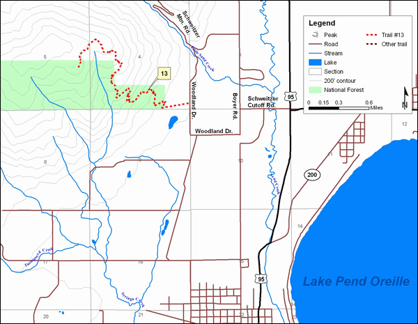
I ran some errands this morning, noting not a cloud in the sky and mid-70's for temps - I simply could not justify staying inside after lunch, even though I have a little sewing project half done. I was being pulled two directions: I could get my walk in at city beach, then read some there (rather than on my back deck) and give sketching those shelter timbers another go; or I could get out in the woods again for a hike and some sketching. When I left the house, I really wasn't sure which way this would go, throwing in both novel for the beach and water and hiking shoes for the woods. Ahh, the pull of the woods was strong, even though the trail I was contemplating, the Mickinnick, is rated "more difficult." It's less than three miles away while the easier ones are farther, across the long bridge which I didn't want to cross on a Friday afternoon. I decided to drive to the trail head just to check it out. Maybe I could handle a small portion of it.

That dotted red squiggle in the upper left is my trail destination

I studied the info and map at the trail head, noted several cars in the lot, and decided to go for it. Not far down the trail I met a man on his way back out, one who looked at least my age and not decked out in hiking gear straight out of Eddie Bauer or REI.  That always encourages me - I can do this! However, the trail quickly lived up to it's rating and headed steeply up the mountain with switchbacks. I knew that half a mile up the trail was a viewing spot with benches and set that as my goal. Surely, even in my out of shape condition, I can make my way a half-mile up this trail. I did, but I was sure glad for the resting spot. I'd made about 200 ft elevation change.

Looking east - View of Lake Pend Oreille & the Cabinet Mountains

I purposely did not throw in a camera this time, knowing I would stay steadier on the hiking and observing if I were not constantly whipping it out for a shot. The view of Pend Oreille Lake was a perfect sketching subject, framed with fir trees which I now noted sported very different needle configurations, and made me rest longer than I probably would have allowed myself otherwise. So rested did I become that I decided to continue up the trail for a bit. I'm not sure how much farther I went but I think at least another half mile. This section had more flat and gentle inclining spots but then would suddenly take off at a steep climb. I have a terrible habit of pushing myself "just a little further, just up around that bend" and I was finding it hard to stop. I kept thinking that surely another bench must be coming up soon, another even better vista the higher up I went, but I finally gave in as I could feel my legs starting to complain. 

View from the 2nd bench (which I did not reach) photo from Trimbleoutdoors.com

It was mostly all downhill, but that too can take a bit out of you. I paused at the bench again, nibbling on nuts and enjoying the view, before descending the last leg to the trail head. Maybe some day I'll have gotten back to my old fitness and make it the entire way to the top (3.5 miles, 2150 feet elevation change), or at least to the second bench about half way there. But for now, I was extremely encouraged, and happy to have finally given this trail a go.

Wednesday, September 03, 2014

Sketching Again

With the jolt of September arriving, I'm realizing I've let a lot of things slide the last month or so, including my sketching. So yesterday I planned my walk for city beach with the idea I would also stop to sketch one of the big shelters there. It's those big supporting timbers set at angles that I've been studying as I pass by, but I'm also intrigued by the grand swoop of the roof. I had the same problem as when I sketched the train station - did not get proportions started correctly and ran out of room to get the full width of the rooflines and those timbers. I instinctive start at the top when perhaps I should start by sketching in the widest part of my subject. All part of the learning process. It was a gray day but not too cool to be in shirt sleeves. The life guards are no longer on duty and only a few people splashing about in the water, but still there are people enjoying the park. I added the bits of color once home.

I've run across another "in praise of sketching" blog post, so am sending you over there to read. It comes again from Austin Kleon but he quotes from Roger Ebert (the late film critic) and how he got into sketching, why he kept it up. Interesting to hear some of the same observations about sketching that I've heard from so many other quarters and have experienced myself, but this time not from someone who was also an artist of some kind. Here's a taste:

"That was the thing no one told me about. By sitting somewhere and sketching something, I was forced to really look at it, again and again, and ask my mind to translate its essence through my fingers onto the paper. The subject of my drawing was fixed permanently in my memory. Oh, I “remember” places I’ve been and things I’ve seen. I could tell you about sitting in a pub on Kings’ Road and seeing a table of spike-haired kids starting a little fire in an ash tray with some lighter fluid. I could tell you, and you would be told, and that would be that. But in sketching it I preserved it. I had observed it.
I found this was a benefit that rendered the quality of my drawings irrelevant. Whether they were good or bad had nothing to do with their most valuable asset: They were a means of experiencing a place or a moment more deeply. The practice had another merit. It dropped me out of time. I would begin a sketch or watercolor and fall into a waking reverie. Words left my mind. A zone of concentration formed. I didn’t think a tree or a window. I didn’t think deliberately at all. My eyes saw and my fingers moved and the drawing happened. Conscious thought was what I had to escape, so I wouldn’t think, Wait! This doesn’t look anything like that tree! or I wish I knew how to draw a tree! I began to understand why Annette said finish every drawing you start. By abandoning perfectionism you liberate yourself to draw your way. And nobody else can draw the way you do."
 Go read the entire post here, which includes some additional links.