
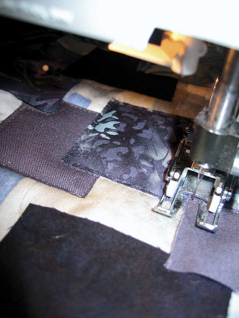
In working with June's challenge painting of the Little Rogue River, I promised myself I would not over-think or overwork it. One look at it and I could easily tap my own memories of time spent along similar rivers. What June captures is the dark undertones of water flowing over boulders, mostly blues shading towards black, but also a hint of dark green - mountain streams flow over beds of great variety, and sun and shadow play a part too. Spring run-off adds frothy white to the mix. I decided I wanted to continue working with the collage idea I played with in my challenge to June, breaking out of the neat and tidy arrangement and doing more overlapping of the shapes. I felt this would work well to portray an abstraction of the rocks mountain streams tumble over and around. To keep the shapes more irregular, I put a fresh blade in my rotary cutter and, from the fabrics I'd settled on during the auditioning process, cut random strips and squares freehand. I refrained from too much arranging and rearranging, reminding myself that some of this would be covered up later.

I let it sit overnight, and after viewing it fresh the next morning, decided no changes were necessary. This time I planned to attach the pieces by stitching close to the edge of each with monofilament thread - no fusible. I held the pieces in place with dots of glue-baste under each corner, then layered with batting and backing so that the machine appliqueing process would also be the quilting process. I don't usually use straight pins to hold the layers together, but with this small piece and the type of stitching I'd be doing, it seemed the simplest approach. My walking foot worked really well for the quilting process.

I wanted a lot of dimensionality so that my shapes would portray the feeling of boulders. Hobbs wool batting provided the loft I was looking for. I added quilting in the areas near the edge, following the shapes in the background print.

And then it sat for several days while I pondered the technical side of the next step: how to give the effect of the rushing water. Today I took the plunge and played with squares of white and blue tulle. Tulle does not photograph well, so it is hard to see what is going on here, but basically, I started pressing in creases and overlaps in each color tulle, then layered the blue over the white, folding some of the white over the edge of the blue. Tulle is springy so pins were necessary to keep things in place.

Once I placed it over my quilted background, I manipulated it some more, trying to get more of the look of a flowing river. But it looked blah to me.

Enter a piece of green silk organza placed behind the tulle (it's difficult to discern but the area above the tulle bundle that looks tan is that organza). It's mimicking that dark green water of June's painting and peeking through here and there creating more depth and interest.

But I'm not sure. I think I need to cut away some of the organza in the center. I need to add stitch to hold the bundle together and accentuate the sense of flowing water, but I don't know with what thread, or whether by hand or machine. I auditioned some threads including an embellishing thread from an Oliver Twist hand-dyed thread pack, then wondered if couching that thread directly on the background might be the better choice. Is the tulle addition too heavy, not abstract enough? The background doesn't show through as much as I'd anticipated. It has no luminosity, the netting giving a fuzzy effect not at all like water. Time to walk away and mull some more.
4 comments:
Maybe try using strips of the different fabrics you have chosen for the water. Then twist them together exposing the particular color in the specific place you choose. Make you machine free motion capable and have invisible thread on the top (probably smoke color). I have done this before and you can use either zigzag or straight stitch but you will only stitch in the places where you want there to be depth like below a boulder. Depending on how deep the water is suppose to be you could also add narrow strips of shiny dark green/blue in with the others to create more depth. I have actually tried to recreate the feeling of water around lilly pads before and I added ribbon to my tulle over a hand dyed piece of fabric that was the water.
Thanks for the detailed description, Debbie. I've been thinking along those lines a bit myself. I stitched the tulle today which improved it, but it still doesn't look right to me when I place it on the background. Probably time to give up on that idea and try working with strips as you suggest.
I love the effect of twisted organza on its own - you've got me heading for my stash! Perhaps you need a different background.
Yes, magsramsay, when I put the tulle bundle on a piece of the background fabric without the applique shapes, it looks pretty good, so I won't just dump it in the trash! Looking forward to what you come up with...
Post a Comment